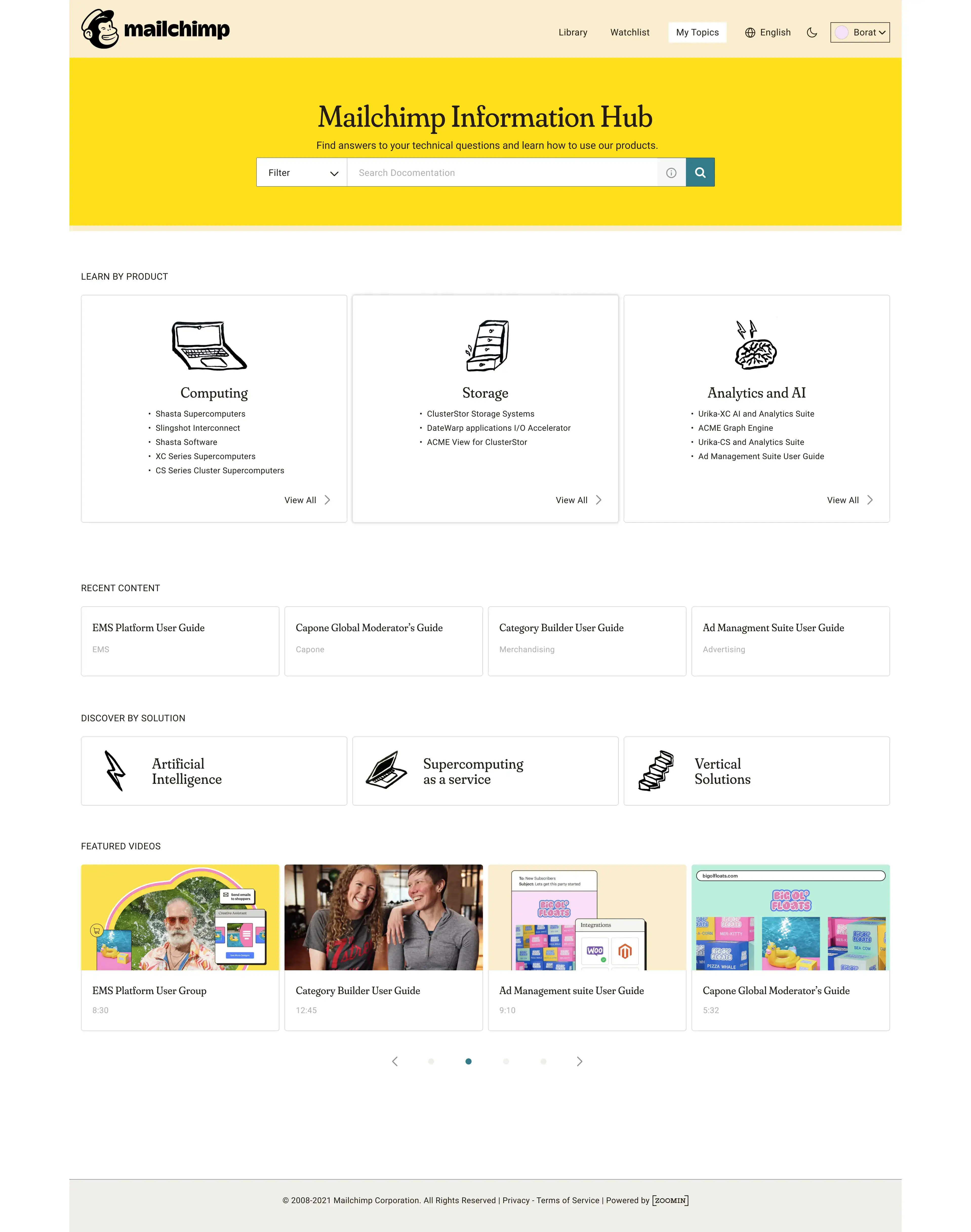
Info center | Mailchimp

How to wrap a familiar brand experience around given ux structure?

Project type
Ui design
About the project
A Ui project showcasing how to apply a company brand vibe to a given structure.
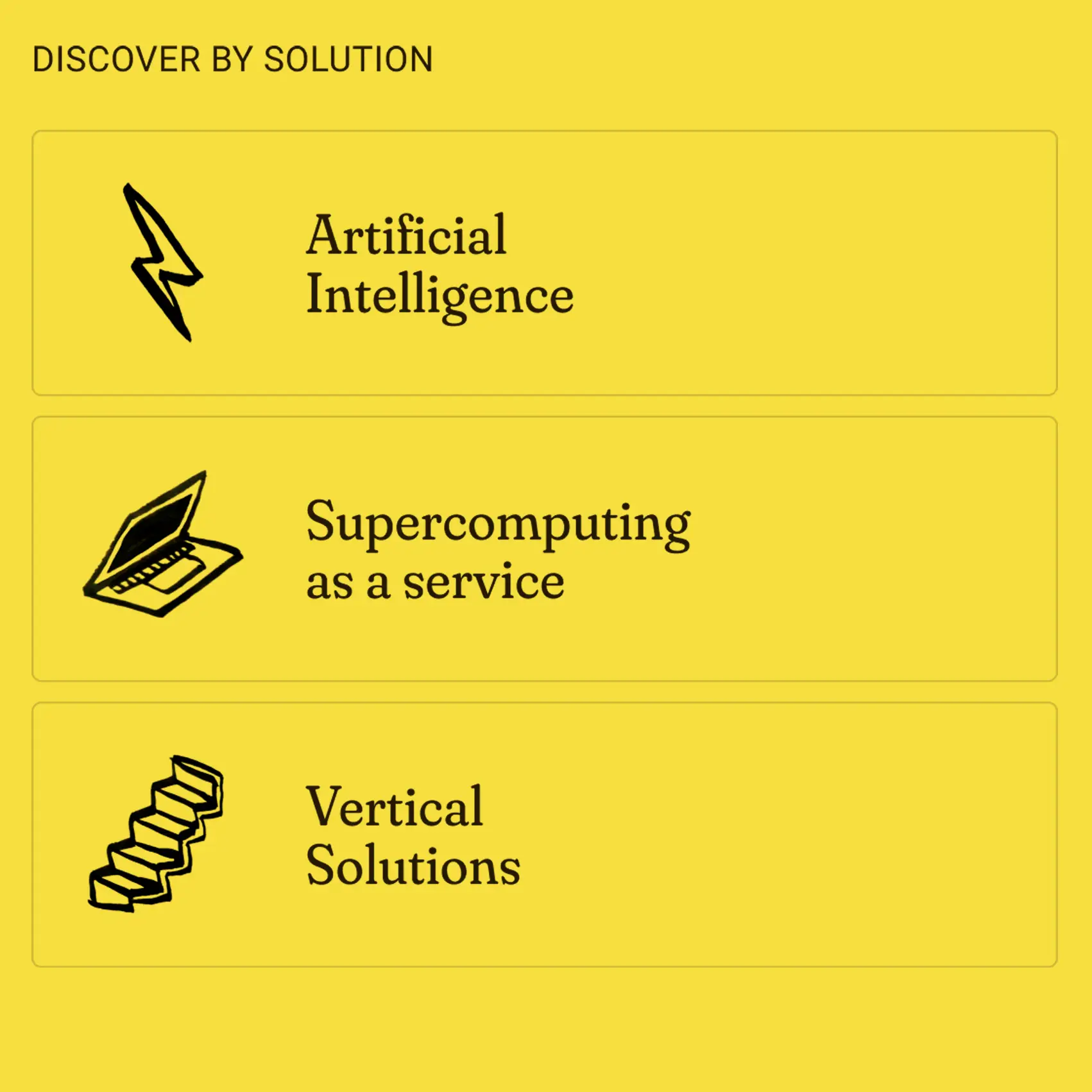
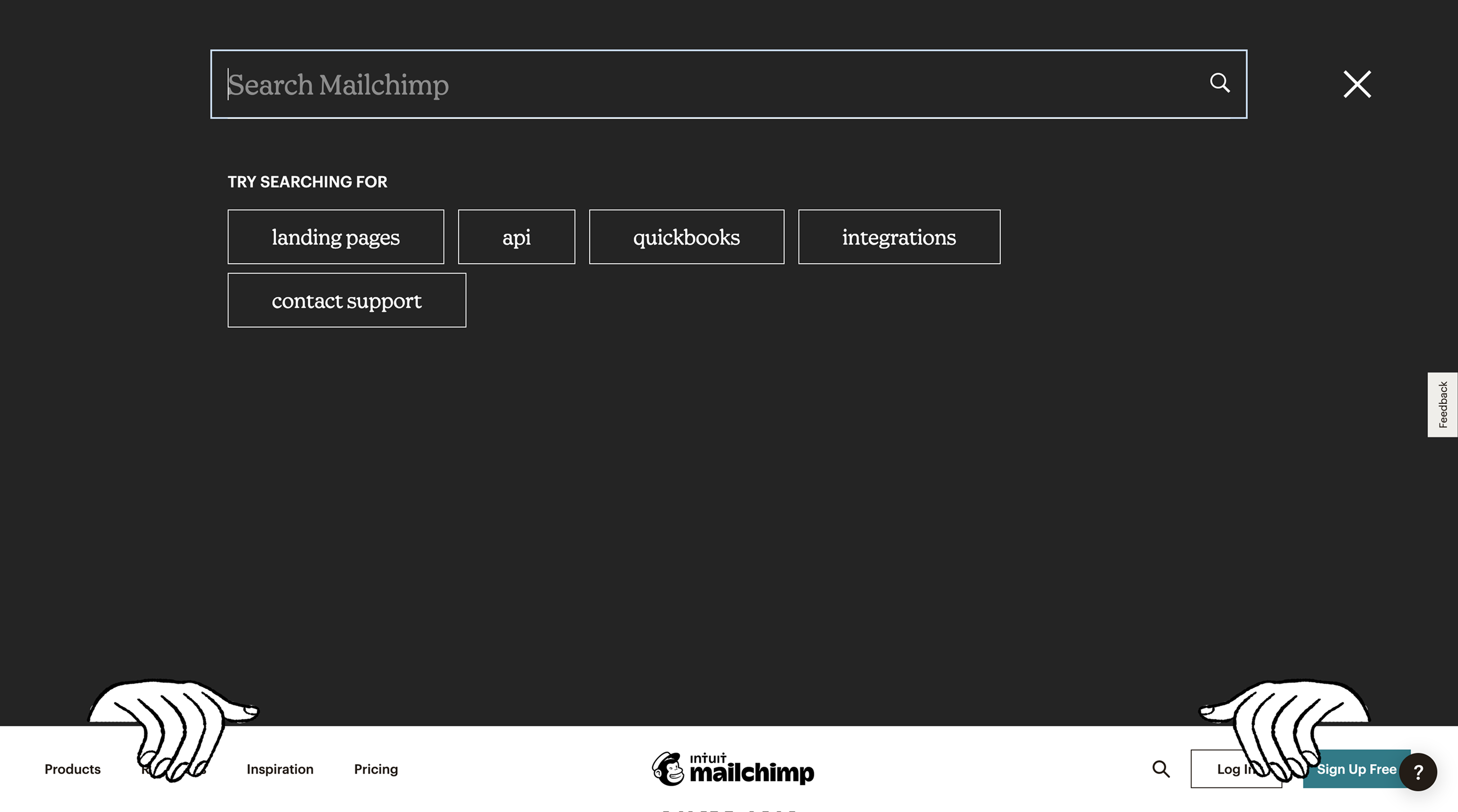
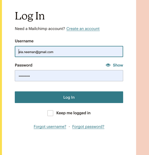
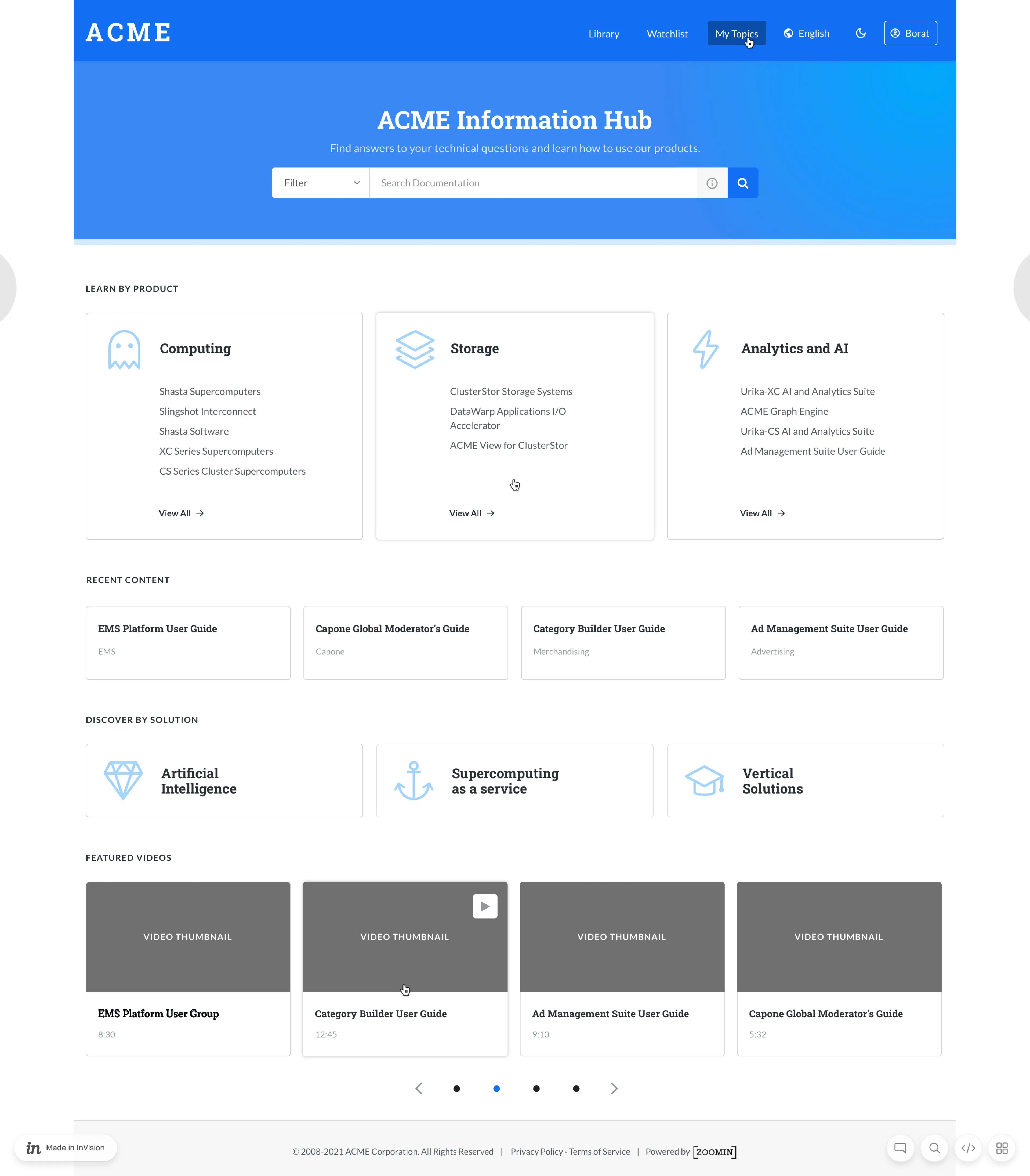
Mailchimp is one of the largest email marketing companies. My aim was to distill and identify the company's design language and to use it on top of a given information center system, showen in this page.
The company users can, using this Ui design, move to this section of the brand without feeling any changes in the look & feel of it.

What was my role?
✔️ Sample the design language

✔️ Choosing fonts to match

✔️ Color palette work

✔️ Creating illustration to work seamleslly with brand guidelines

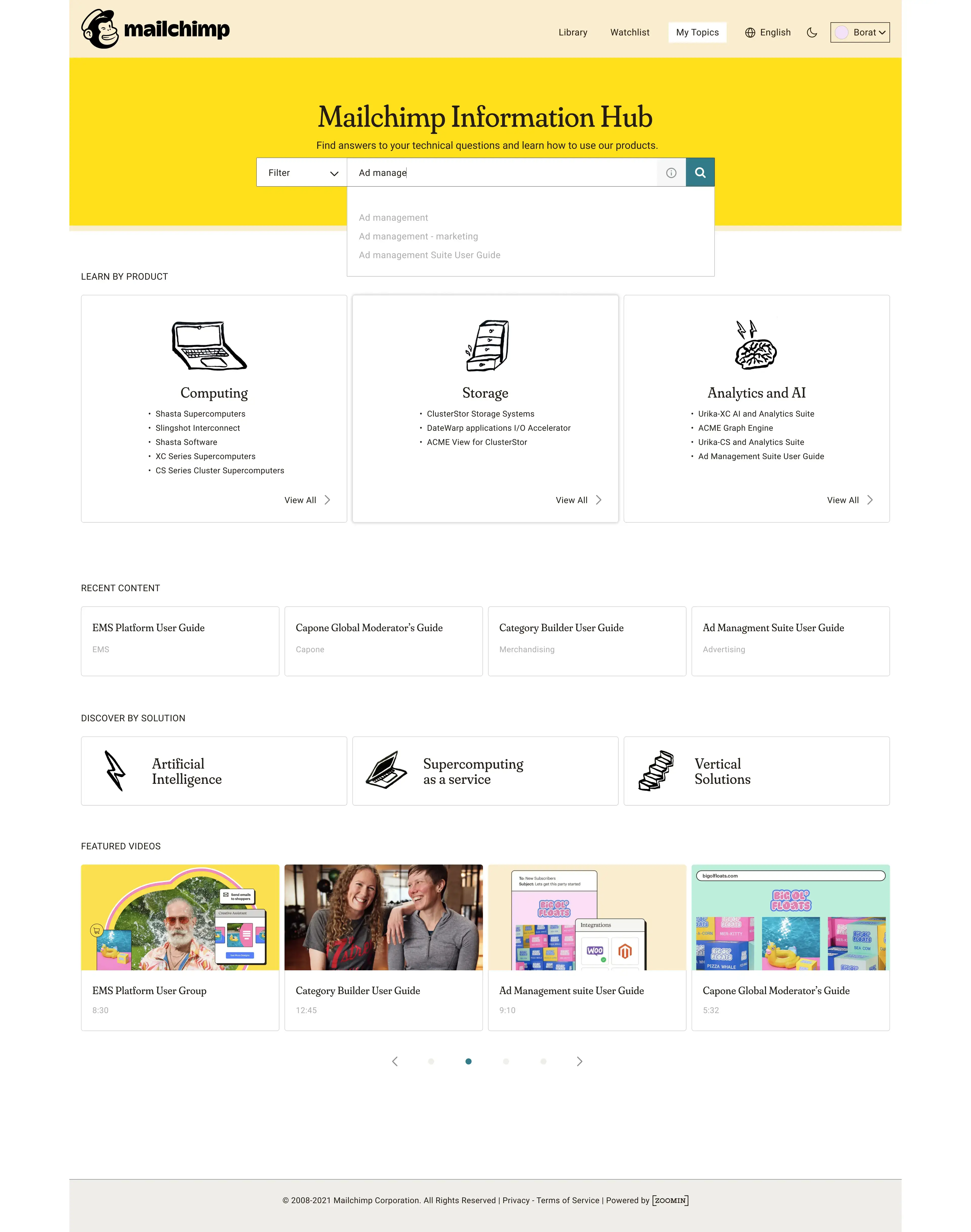
✔️ Making sure all interactions stay clear and useful

✔️ Wrapping up the whole page areas to a ready-to-dev product
Design language analysis
I researched the brand websites and collected various angles of the design elements and language to my work file.
The given UX structure
My Ui design
Open search
Prev project
Next project
Let's work together
Let's talk