E-learning App

Course completion state: turning an end to a new beggining

Project type
UX design
About the product
Now You Know is an E-Learning startup which focuses on making expert-led learning experiences accessible to users worldwide, from the comfort of their homes. Imagine following easy and beautifully made instructive video on how to decorate a fancy birthday cake, for example.

As a product designer, my role on this project was to characterize the completion user flow, and to lead the user to a new learning experience. It's not a goodbye yet!
Who are our users?
Self development enthusiasts
Our users spend their free time exploring creative projects, learning both online and offline, and watching tutorials on YouTube and social media. They are eager to learn, experiment, and try new things.
Women aged 30–50
Our data indicates strong interest among women aged 30–50, many of whom are parents, across several segments.
People who follow creative influencers
In the social media era, creative hobbies are thriving. Craft-driven content is a major source of inspiration for people around the world.

Our users are the ones who make, bake, knit, and create. They share their work with others because they take pride in the new skills they develop from home.
The problem
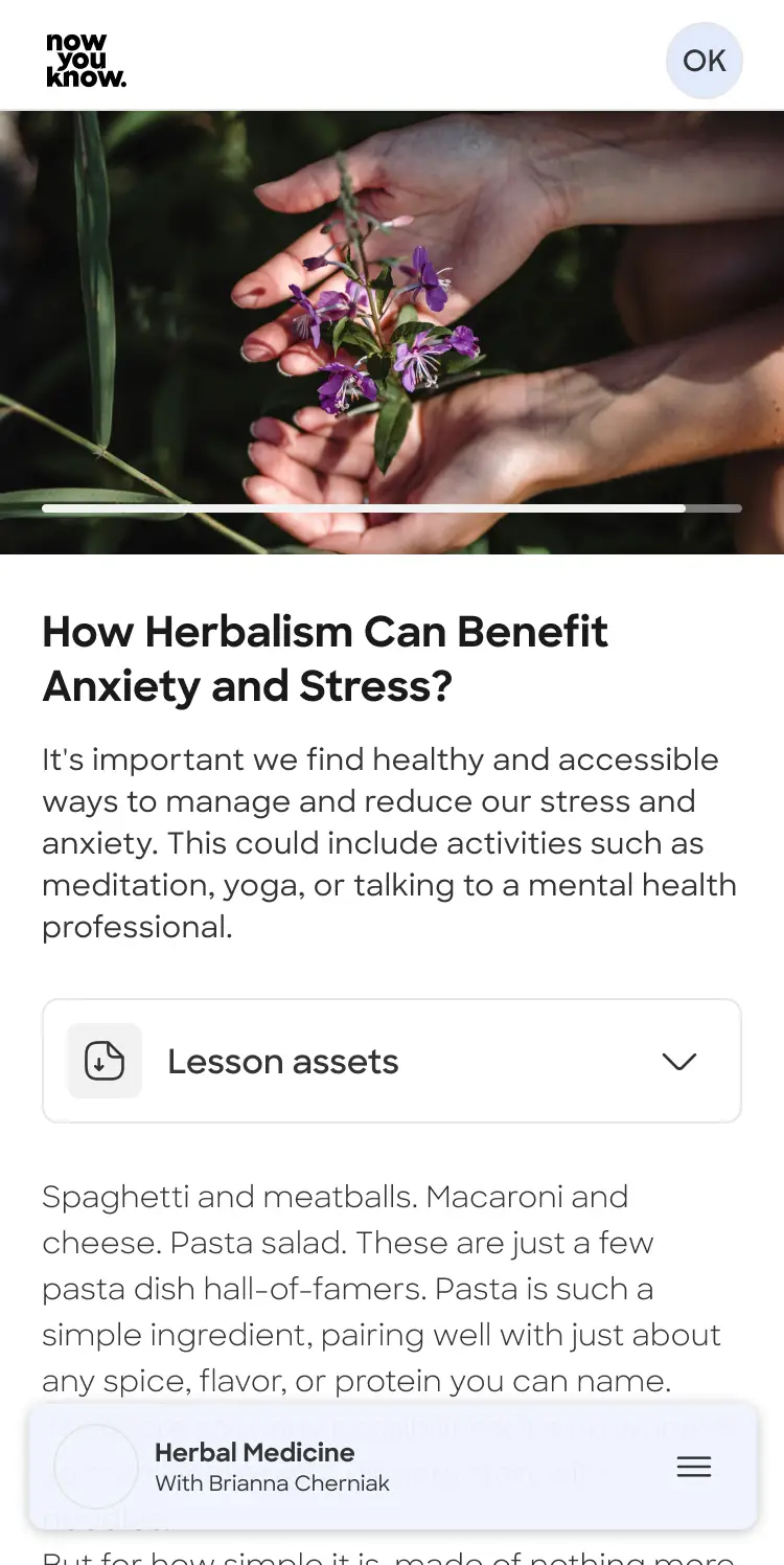
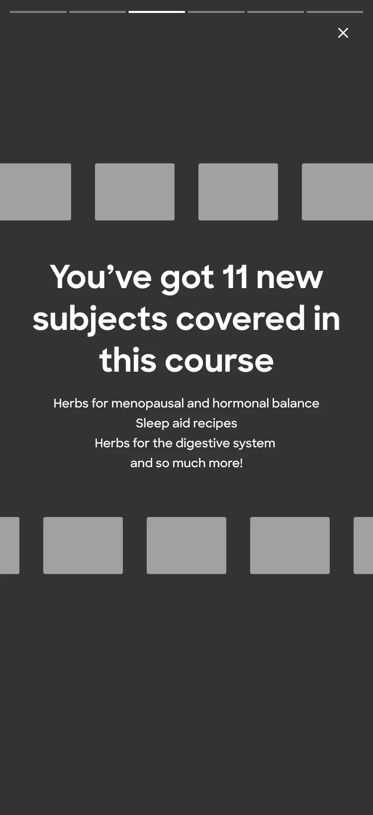
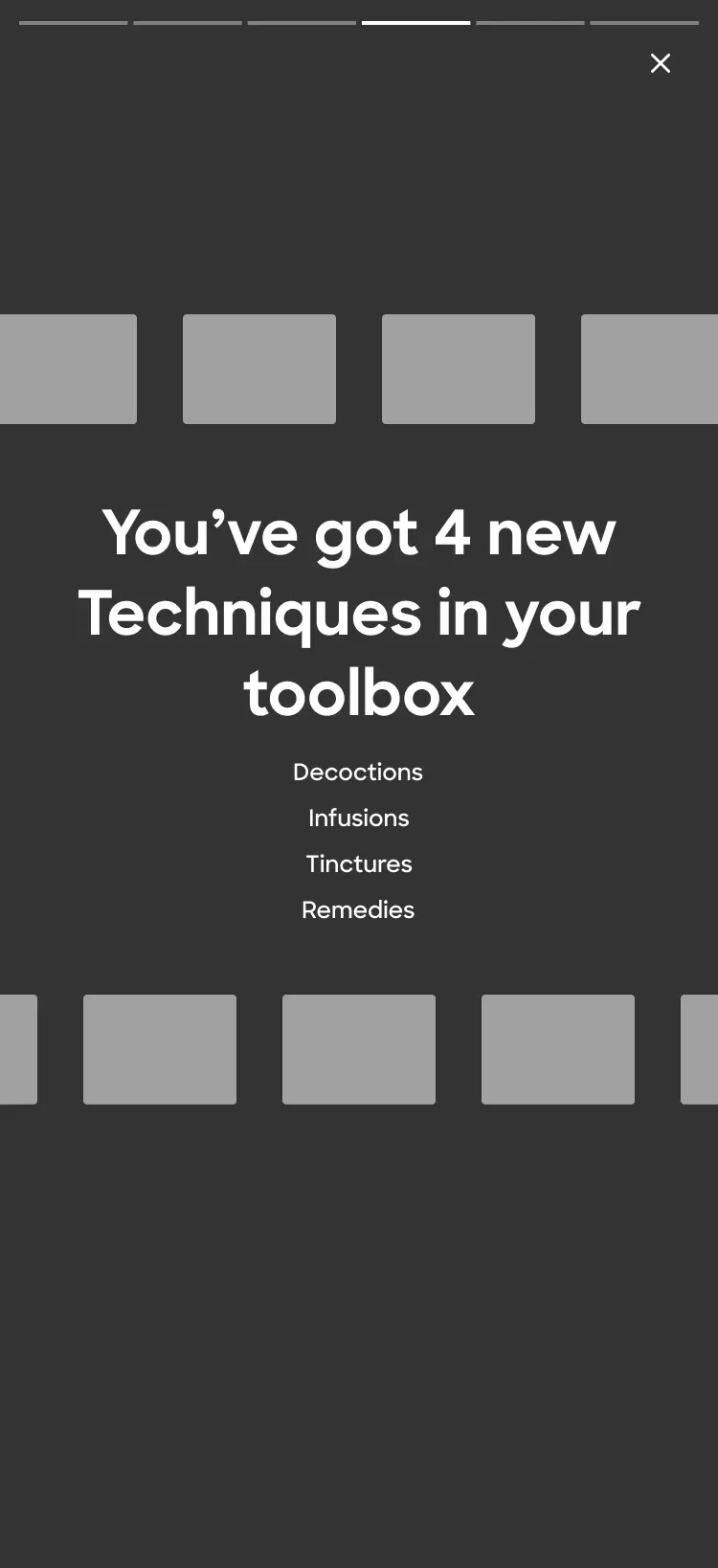
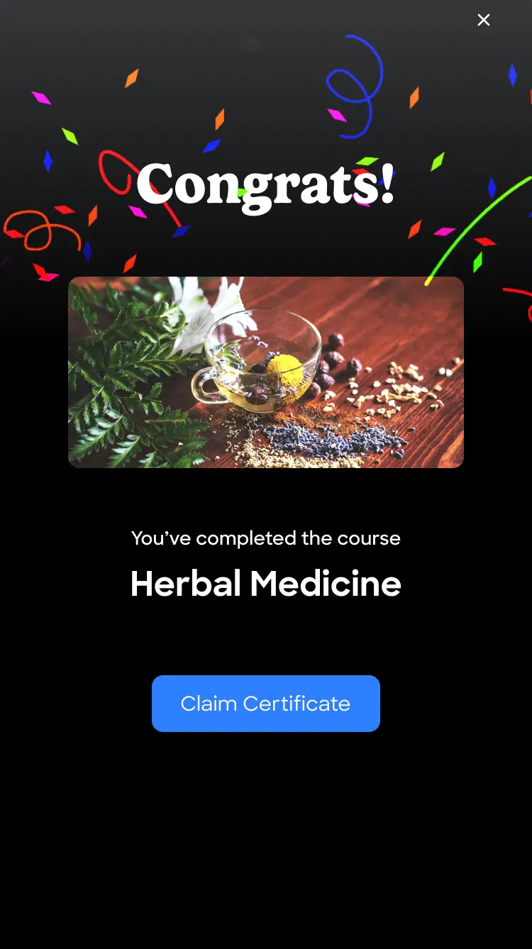
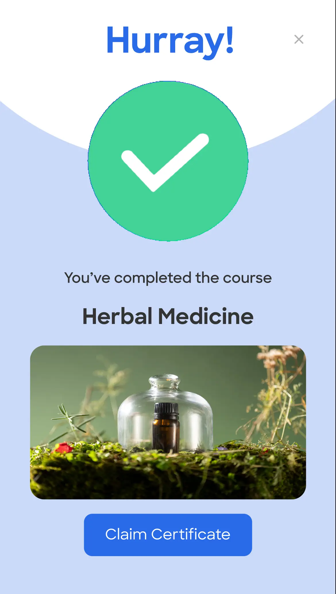
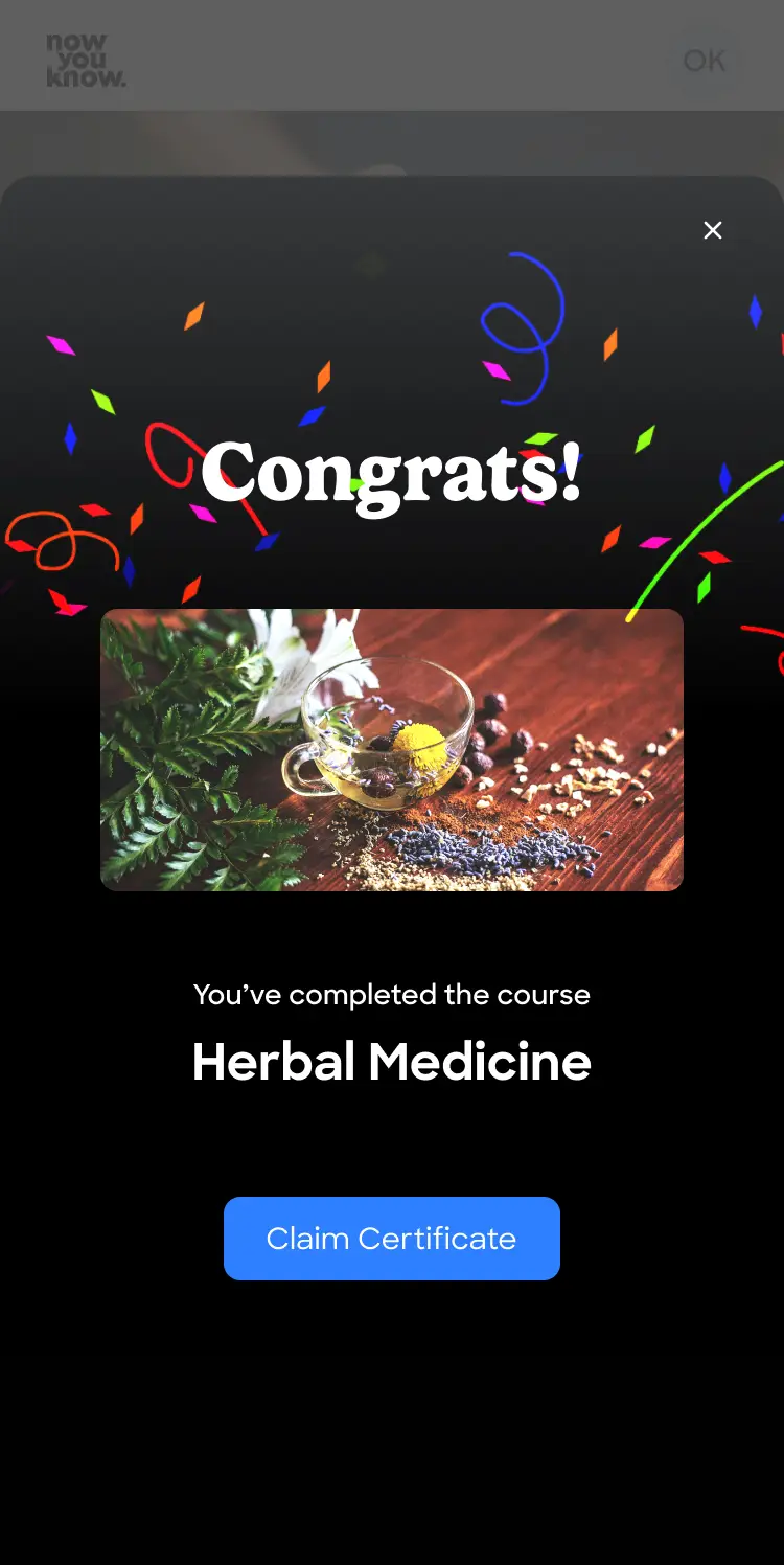
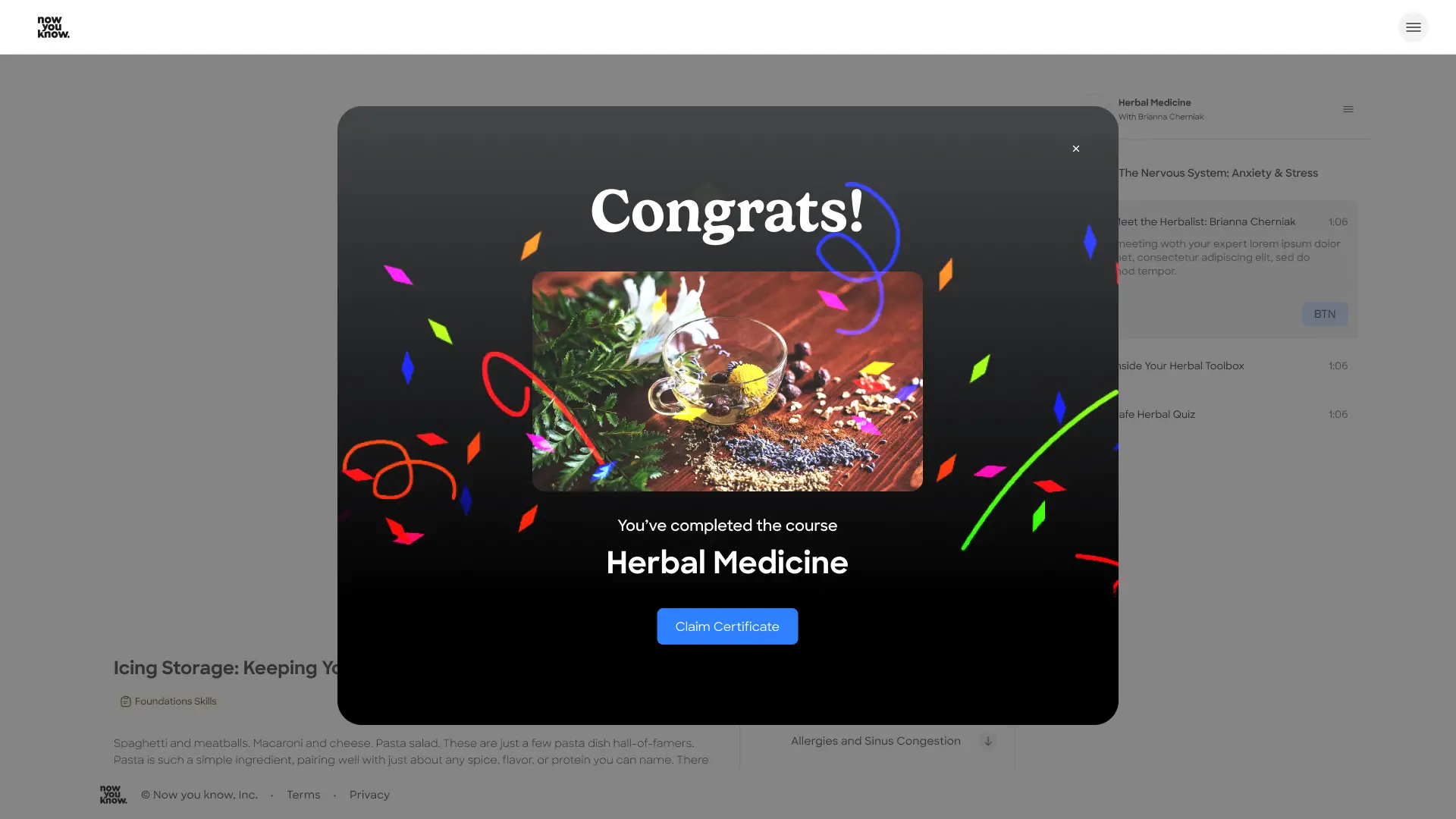
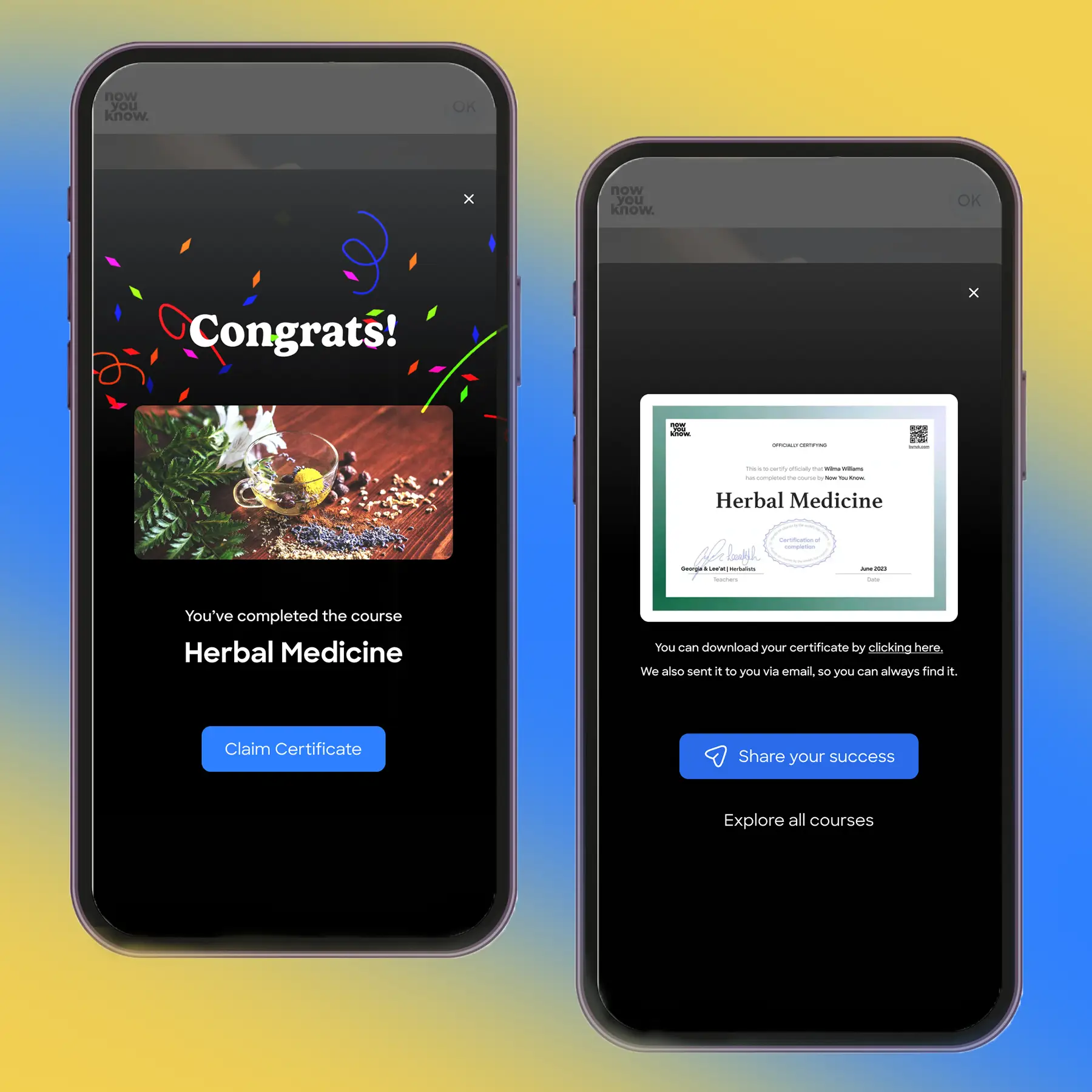
Once users completed a course, their journey simply ended. We saw this problem clearly when our courses were hosted on an external platform, Teachable.

This critical moment, when users “finish” their interaction with the product, was left unresolved. Instead of becoming a point of continued engagement, it often led to drop-off.

The challenge was clear.
How might we turn this ending into a valuable new experience?
How do we reduce abandonment and maintain engagement?


Previously, with the experience outside our control, the only follow-ups were through email or social channels. We saw this gap as an opportunity to transform a dead end into a meaningful next step.
The goals
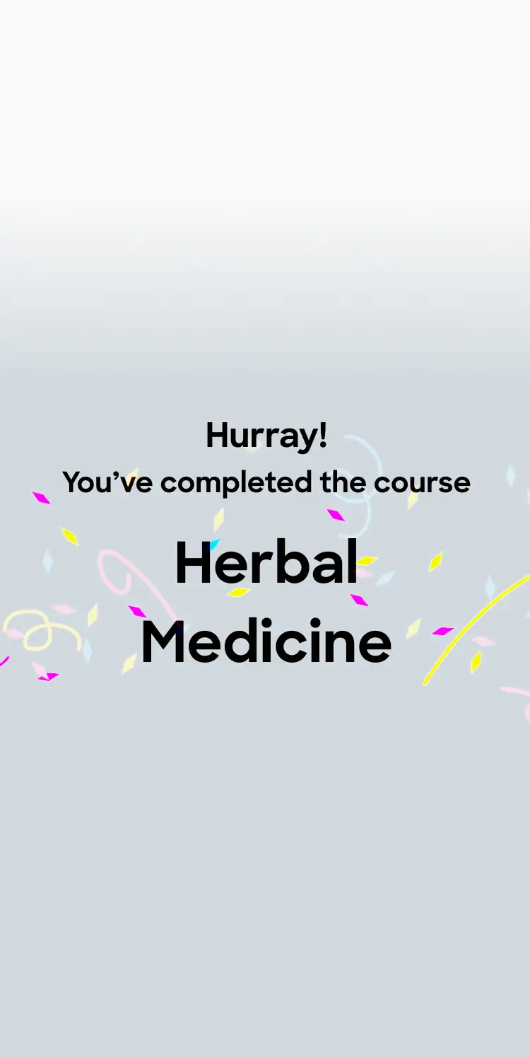
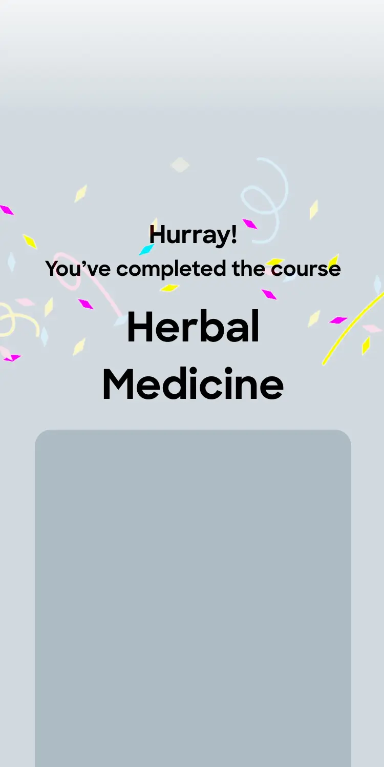
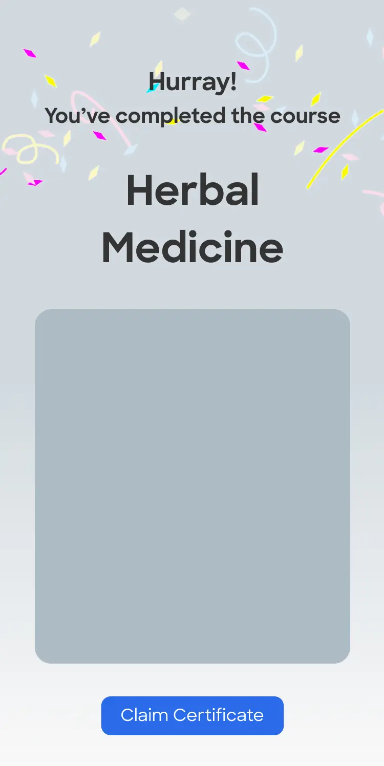
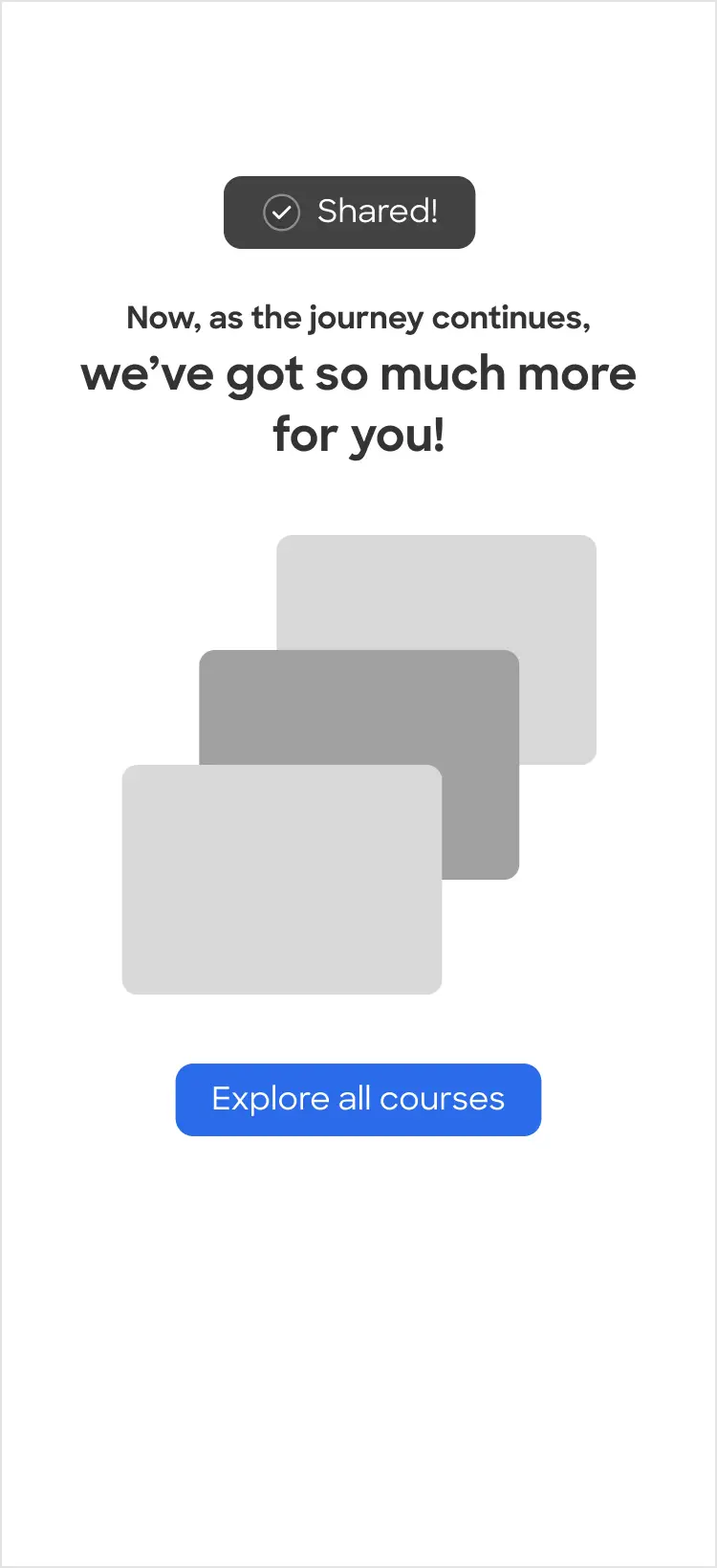
Increasing continued engagement
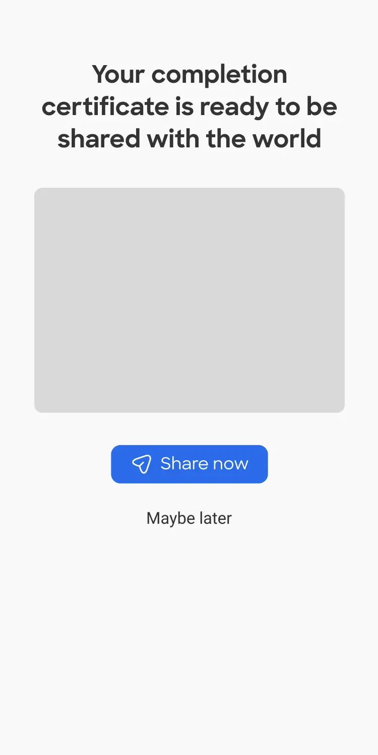
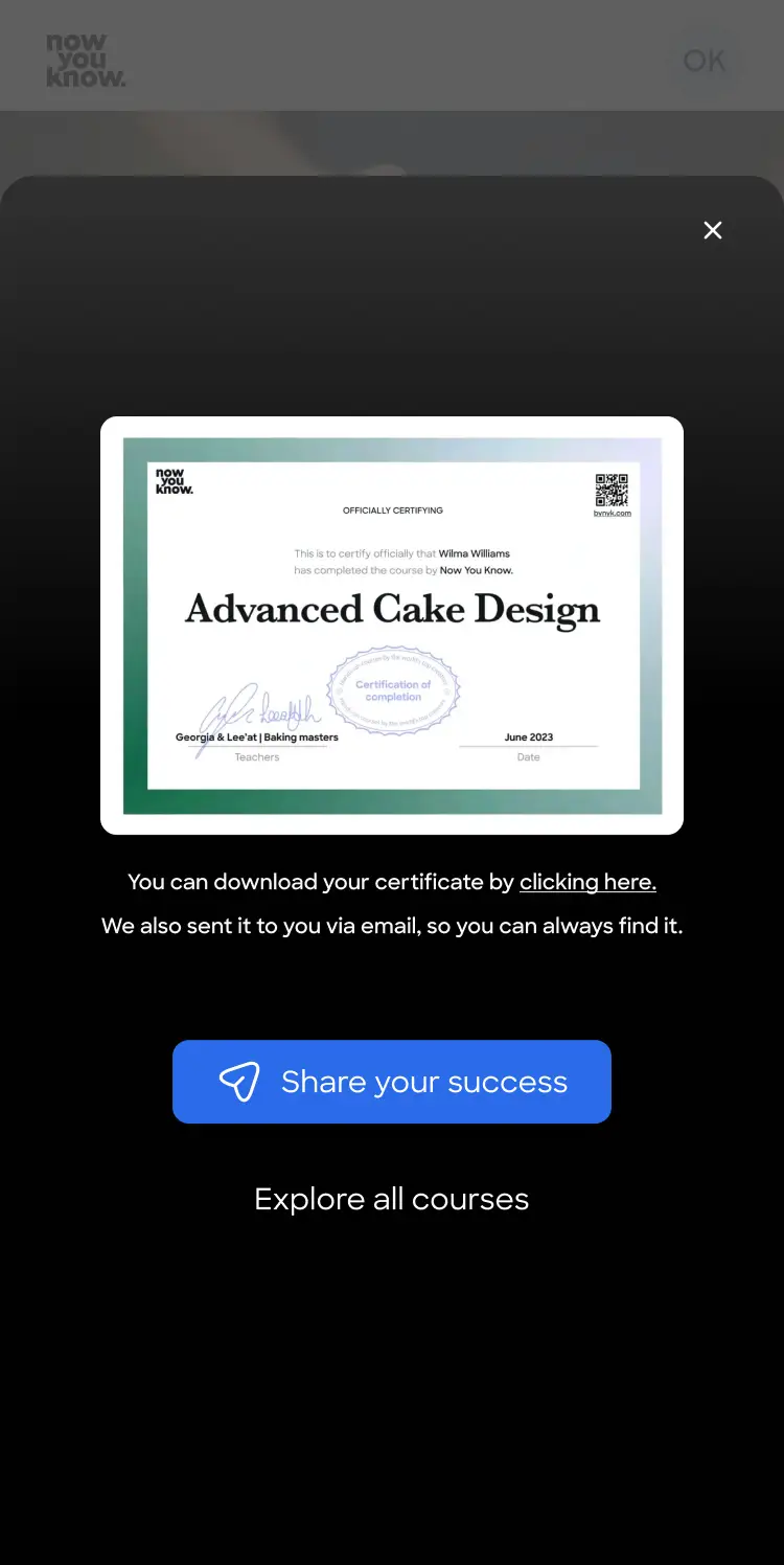
When completing an online course, the end can feel empty and leave users wondering, “Now what?”
This moment is an opportunity to guide them forward—encouraging them to share their achievement and discover new skills to learn.
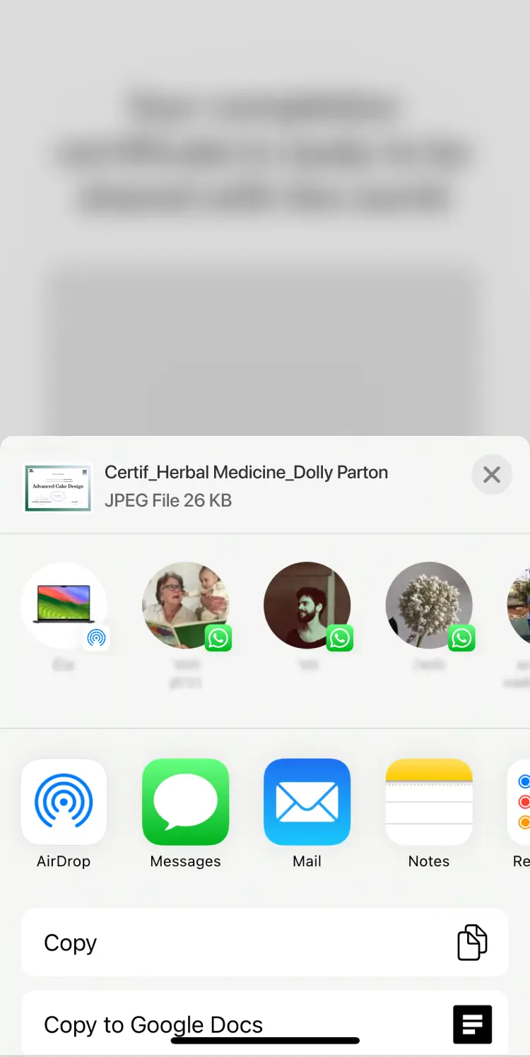
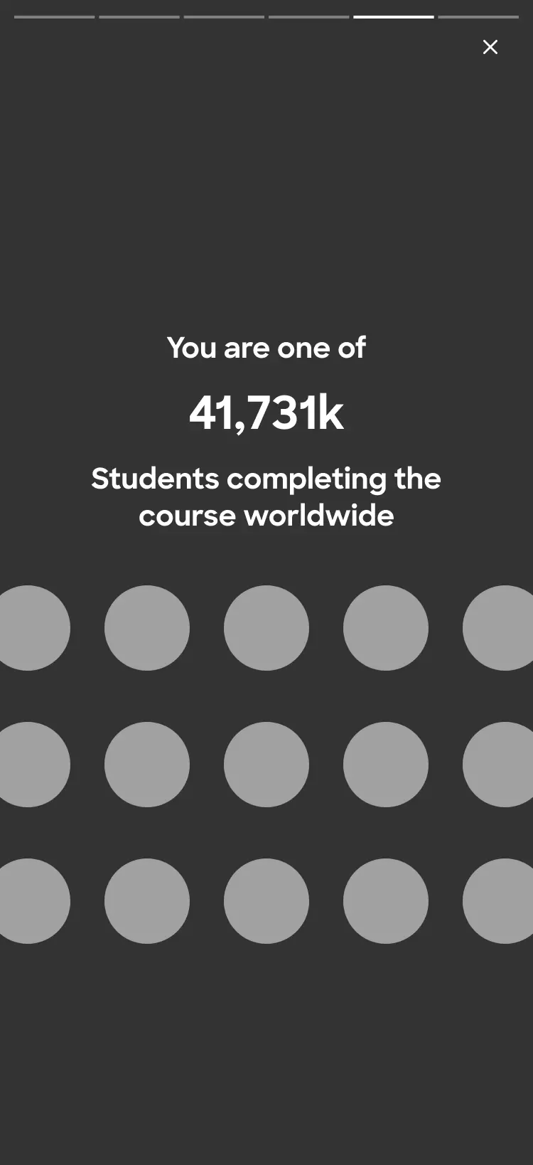
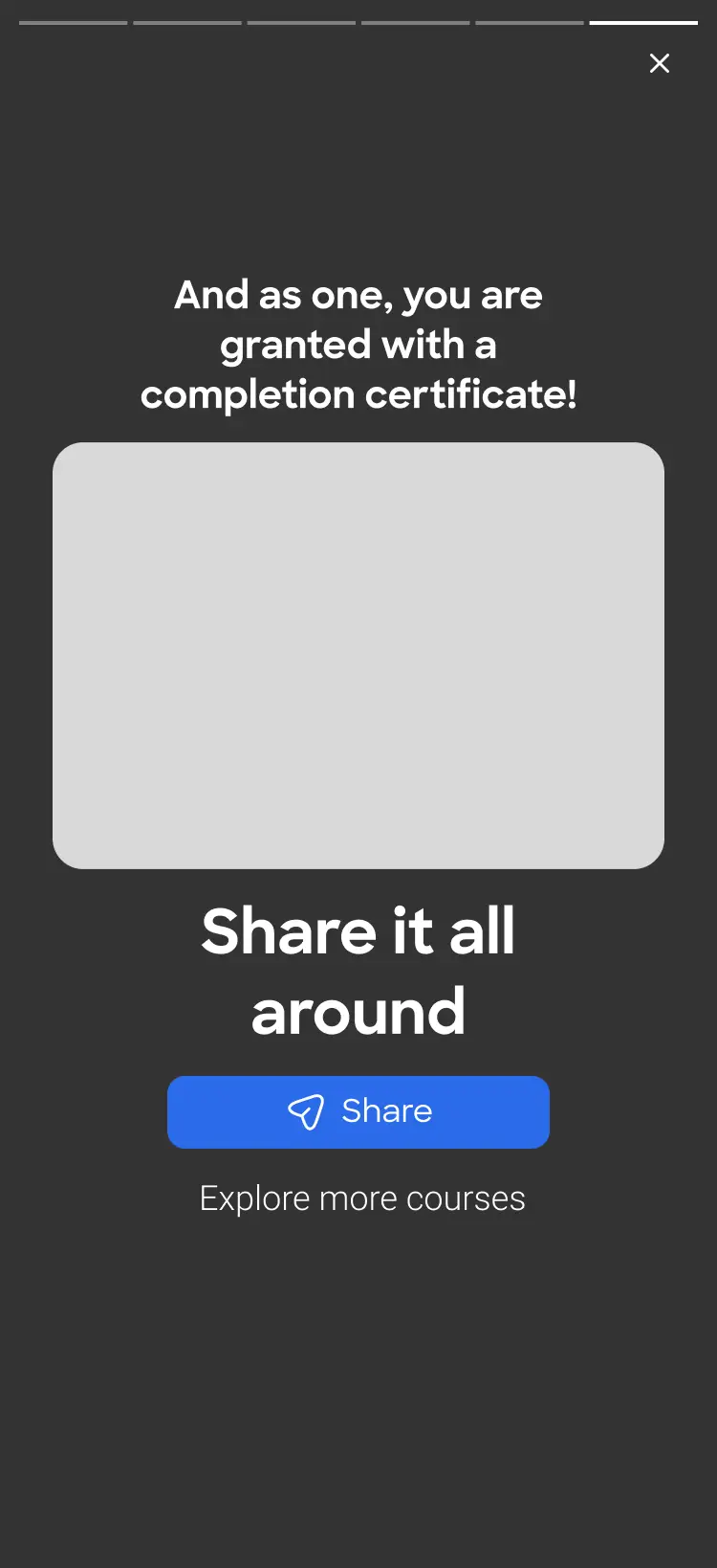
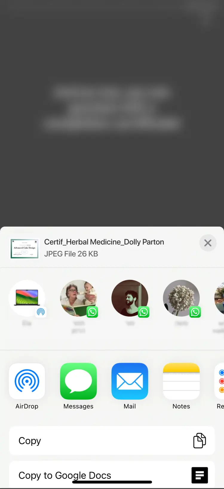
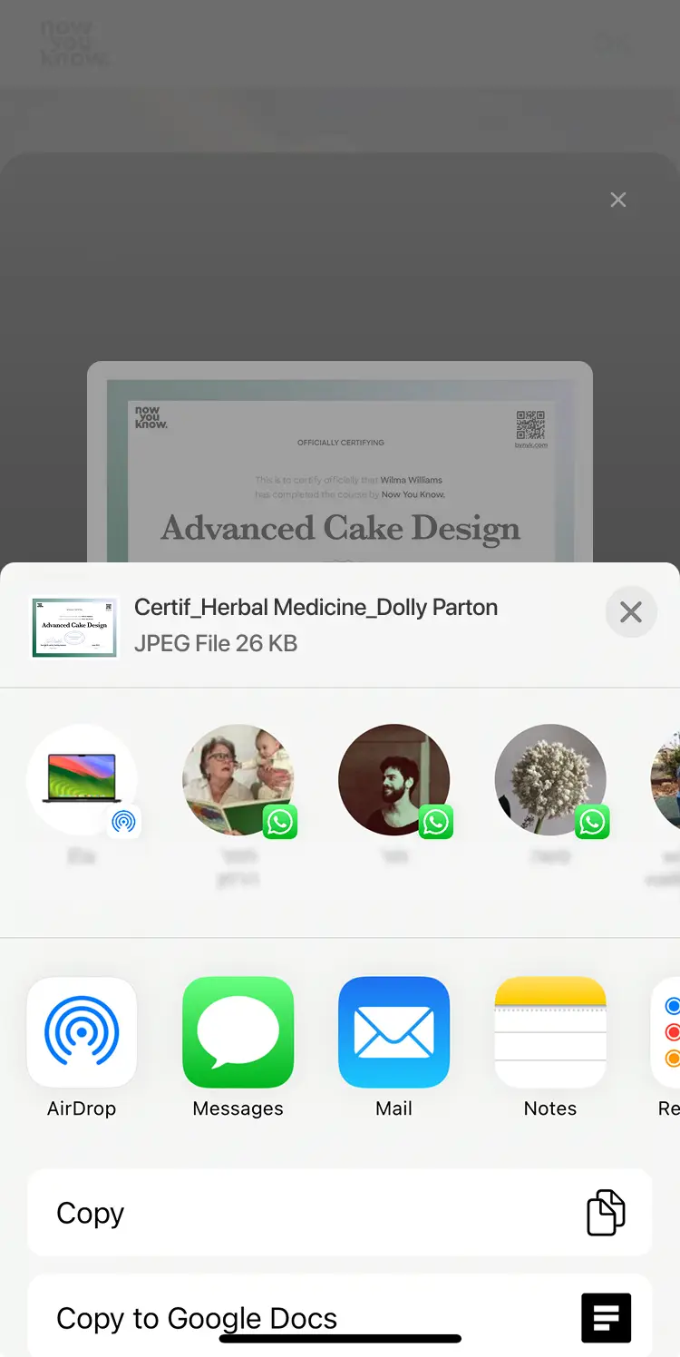
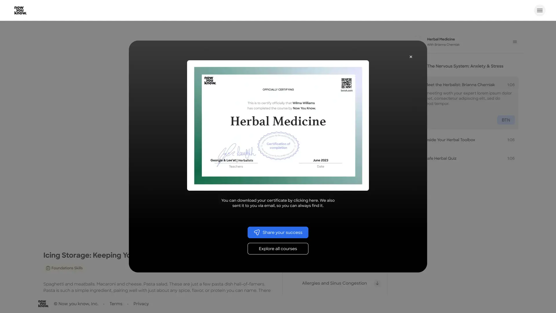
Promote our platform through user achievements
When users share their completion certificates, they extend the product’s reach—exposing it to potential new users across social platforms and personal networks.
The starting point
Lesson page - End of lesson
This is the lesson view page of the platform. The user views the content here in a conventional video player, with all the common view options and functions.
It also contains all the downloadable assets, a short text and a navigation options to go back to the course page.

from this point, what happens when the last video lesson of the course ends?
Work process
As our core pages were already avaliable, I used the DS Ui structure and design to craft variations on this task.
Best practice research
I studied “wow” moments across a range of products, analyzing how they handle completion and what they offer users next.
I looked at products from Youtube and Tinder to MasterClass, Spotify, Duolingo, and MyFitnessPal - apps that guide users through journeys of accomplishment and challenge.

Some lean into gamification, while others remain elegant and restrained, but all use this moment to introduce the next step and extend the experience.
Pencil and paper
I start with pencil and paper to quickly explore ideas without distractions. Low-fidelity sketching helps me focus on structure, flow, and core concepts before moving into more detailed design.After reviewing and refining the strongest directions with the team, I move into Figma to develop a more detailed, mid fidelity solution.
Review and final design to DEV
The UX designs were reviewed again and presented to the DEV team to collect feedback and avoid technical problems in the execution.
UX design
After analyzing the business opportunities within the completion state, I designed two different UX approaches.
The challenge was identifying what matters most to the user at this moment: the certificate, sharing the achievement, the sum up of all the lessons or the "climax" moment after completing the learning experience.

In both approaches, I chose to first celebrate the achievement with different hierarchies of the achievements and the final reward.

My first understanding was that a share option here is a must, and this short process must lead to it and make it very easy.
UX principles considered
I explored success states and experience peaks by analyzing best practice products, both within and outside our domain.This user-centered perspective helped clarify the value of the completion stage and guided my design decisions.
Peak-End Rule
Users remember experiences by their peak and ending, rather than the entire journey. I want to amplify it with celebration and a final reward.
Positive Reinforcement & Motivation
By celebrating achievements and suggesting to share them we reinforce the likelihood of repeating it (i.e., starting another course).
Continuity
Encouraging to continue to next course in this stage reduces drop-off, maintains momentum, avoids “dead ends". An end is a new beggining.
Social Proof & Sharing
The sharing option is a crusial - it turns users into promoters, validates achievement socially, builds product visibility and combines social proof with growth centered design.
Emotional Design (Delight)
The delight layer in a product is an important encouragement and engagement tool. It adds personality, makes the experience memorable, and strengthens brand perception for the user.
What users value most:
Personalized content
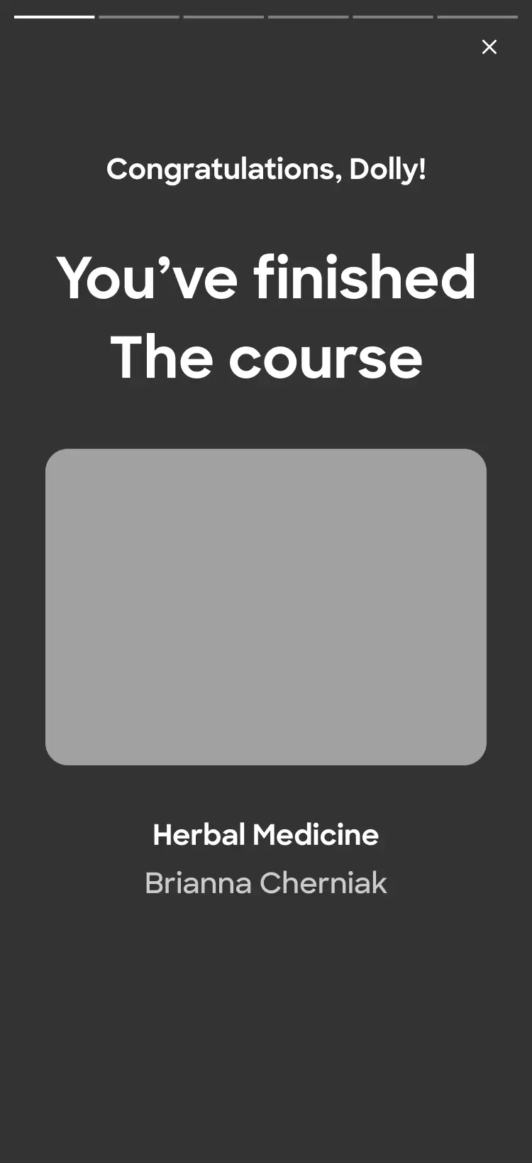
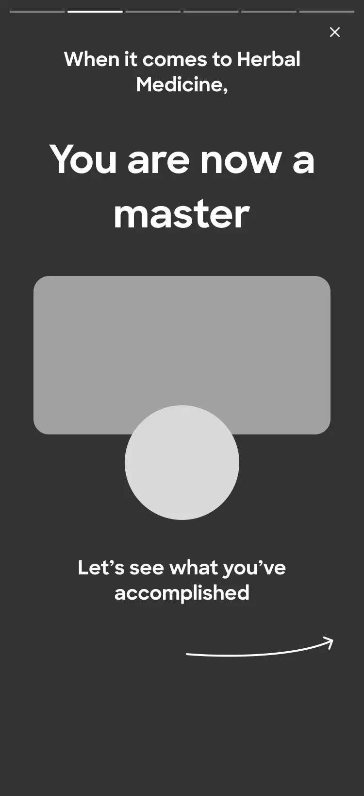
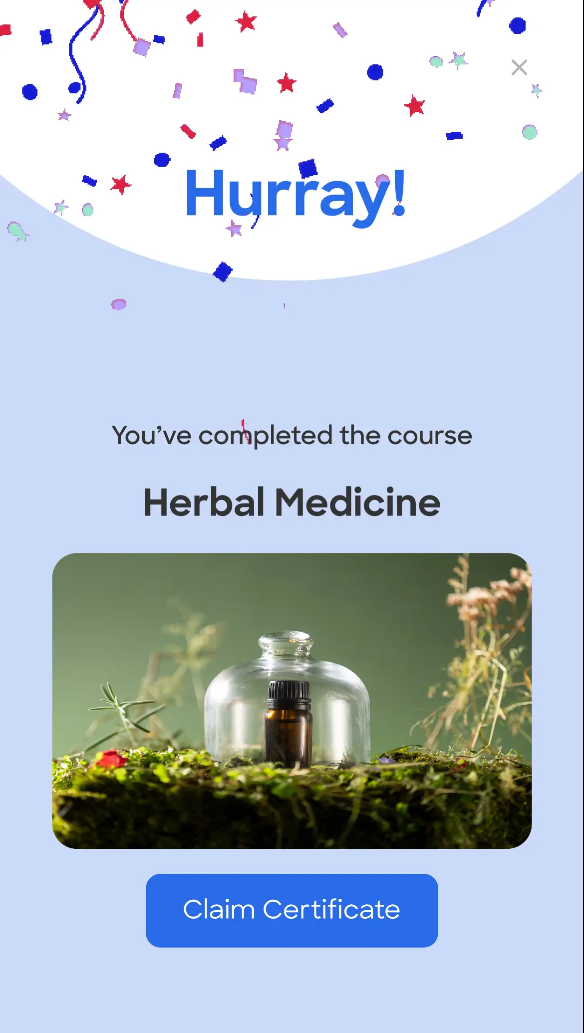
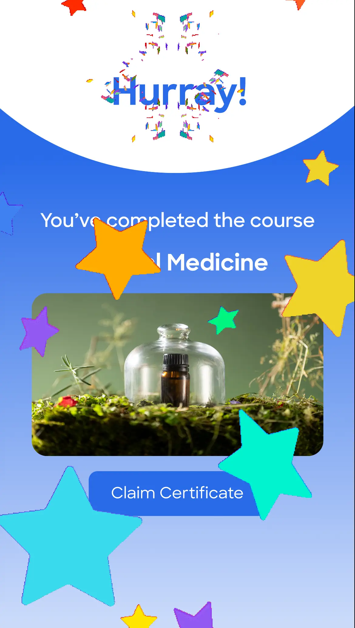
Recognition and validation of progress
Opportunities to share and feel proud
A sense of celebration after effort or routine
A rewarding moment at the end of an experience
The solution
Option 1 - Simple share
Straightforward and direct, this option leads the user straight to the point - sharing their certificate of completion and spreading the word about both their achievement and our product among friends, family and colleagues.

Option 2 - Course wrap (Spotify inspired)
This option is designed to truly celebrate the achievement and turn each course completion into a special event - something worth the wait and the effort.

As the peak moment for the user, I wanted it to feel rich, with layered animations, moments of reveal, and a sense of encouragement.

Product desicion
As our platform was in it's first MVP stage, the descion was to start with the simple share option and leave the more rich experience to later stages.
Final Ui screens
Social proof for added trust, clarity and a fluent experience
In the final stage, I added to the design system the elements I needed and created the larger breaking points for DEV.
Desktop
Impact
This process clarified how critical the completion state is—both as an emotional peak and a key decision point for continued engagement. In e-learning products, these moments occur frequently, becoming important turning points in the core user journey.

The work reinforced several principles: designing for the peak-end moment, and balancing emotional reward with clear next actions. While the company’s direction later shifted, this exploration helped define potential strategies for the completion experience and informed future thinking around engagement and retention.
Ultimately, it shaped how I approach designing meaningful moments that drive both user value and product growth.
Let's talk
Back to projects
Next project
Let's work together