E-learning App

How to display Questions and answers in an online course lesson page?

Project type
UX design
About the product
Now You Know is a global startup which focuses on making expert-led learning experiences accessible to users worldwide, from the comfort of their homes. Imagine following easy and beautifully made instructive video on how to decorate a fancy birthday cake, for example.

As a product designer, my role on this project was to characterize the FAQ feature and improve the experience in the new company platform.

The shift to an independent platform was an important step after using a host platform (Teachable) for the course content. It was crucial to have full control on the experience, start to end.
Who are our users?
Self development enthusiasts
Our users spend their free time exploring creative projects, learning both online and offline, and watching tutorials on YouTube and social media. They’re eager to learn and try new things.
30-50 aged women
Our data indicates strong interest among women, primarily parents, across several age segments.
People who follow creative influencers
On social media era, creation and hobbies are a hit! Crafty content is a main drive and a source of inspiration for many people around the globe.

Our users are the ones who constantly make, bake, knit, fix and tell everyonr about it -because they feel proud with the new skills they accommodate withput leaving their home.
About the project
While we have a good understanding of the way our users follow the content and view the course, we didn't have a solution to how to deal with user questions? When the courses were hosted in another platform, out ofour control, the users could reach out by email and sometimes were commenting upsetly on our instagram page when having problems, which clearly was not ideal.
Problem and motivation
Increasing the lesson completion rates
Imagine our user watching a course she chose at home, perhaps following along step by step.
When she encounters an issue with the process or the content, she may feel frustrated and lose patience — which will lead to abandoning the lesson.

Our goal is to support her in completing the course, lesson after lesson, and to help her create something she feels proud of and empowered by. Ultimately, we want to encourage her to continue enrolling in new courses, unlocking more skills and growing through our platform.
This feature thesis was that by allowing the user to ask questions and presenting her answered ones, we can reduce this frustrastion and achieve higher completion rates.
User insight touchpoint
Another motivation, a secondary one, is that by collecting the data of such feature, we basically get really important information about the quality and clarity of the content, and can fix and learn from it to improve at the future!  
Work process
As our core pages were already avaliable, I used the DS Ui structure and design to craft variations on this task.
Pencil and paper
I started with pencil on paper sketching of the FAQ tab structure and task flow, and after discussing it with the team I concentrated in the two different approaches I designed and kept on with refining them and exploring all the nuances and options each one has.   

Review and final design to DEV
The UX designs were reviewed again and presented to the DEV team to collect feedback and avoid technical problems in the execution.
UX design
Point of departure - Lesson pages before feature added
Lesson page
Lesson page - default view with FAQ tab
"Social" variation:
Firstly, I considered showing the user the questions and answers by expert as they used to see it on a social media post. I checked different approaches within this idea.
Social V1:

The answers are slightly indented to make them easy to identify on a quick scan. "Ask" field on top.
Social V2:

Questions and answers wrapped separately to allow social actions on each. "Ask" field on top.
Social V3:

Questions and answers wrapped together to simplify. "Ask" button takes user to question state / screen.
Expand collapse variation
Secondly, I tried a more minimal and straight forward approach, which clears the visual load with an elegent and tucked-in interaction of aclassic expand collapse. This way, the user can easily scroll down and find the relevant questions for her, and avoid the others. Simple, shorter page.
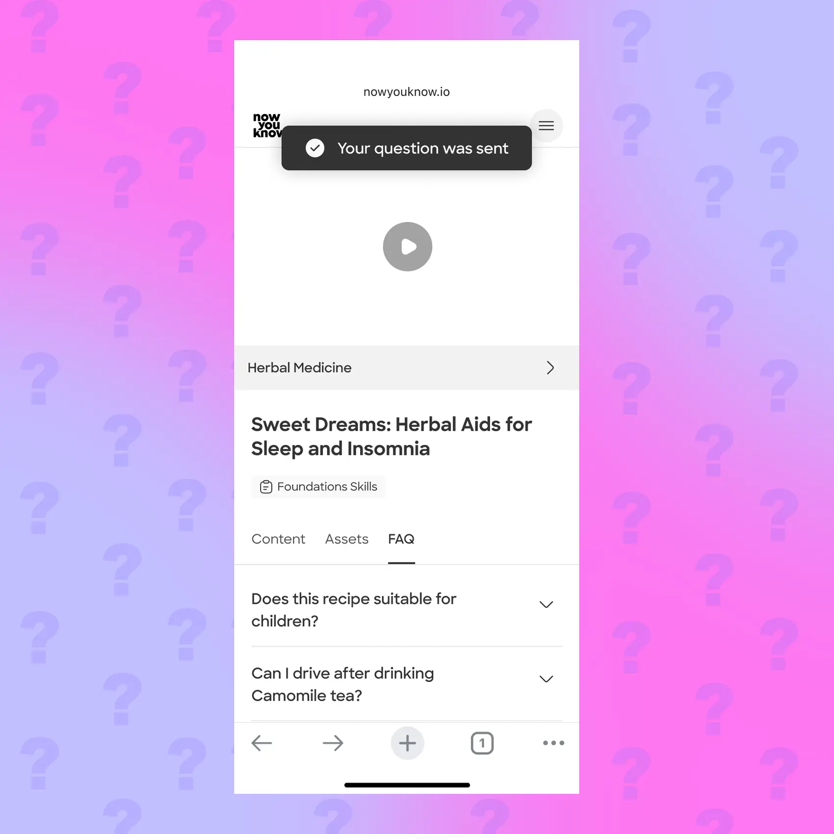
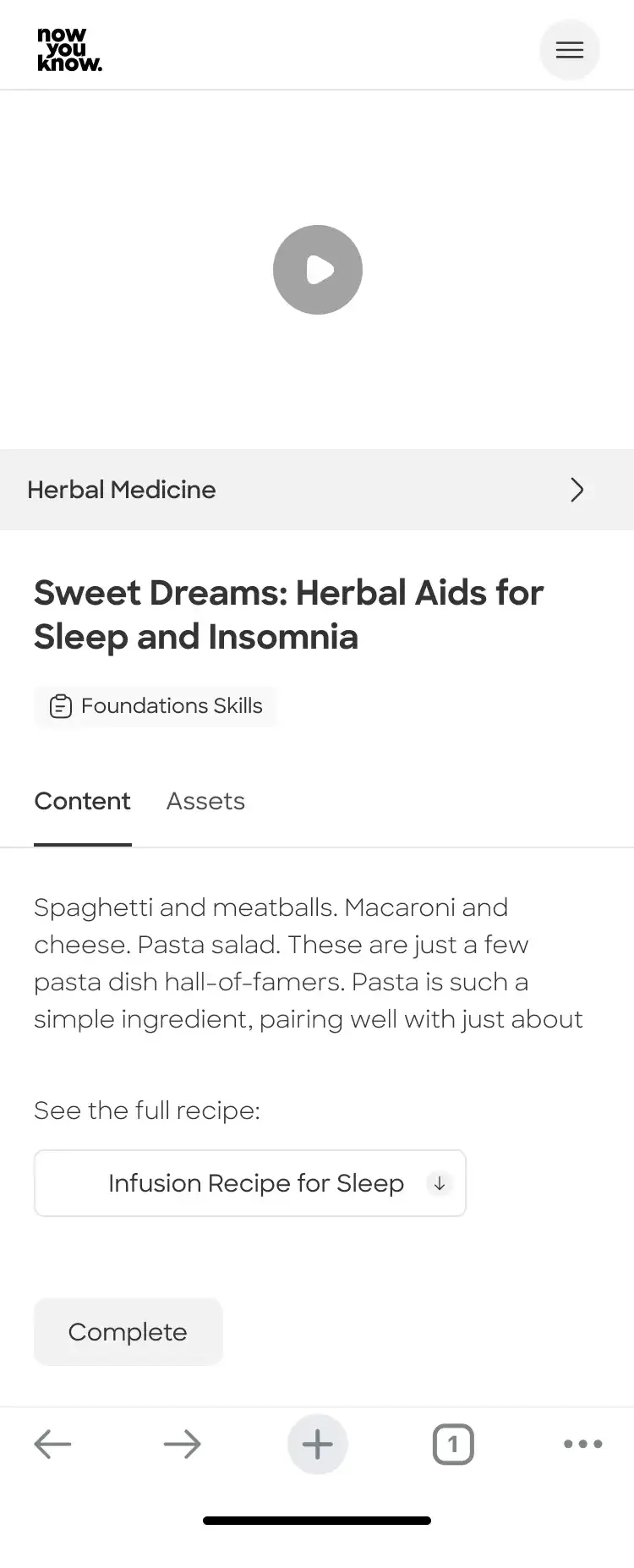
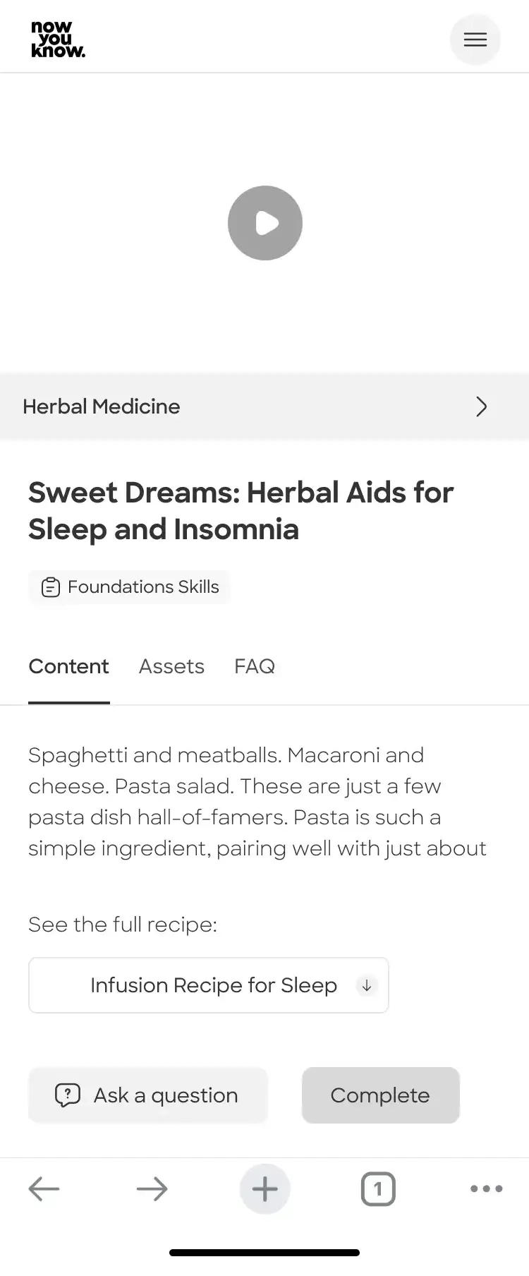
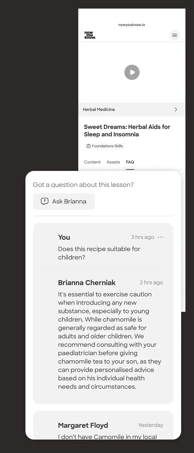
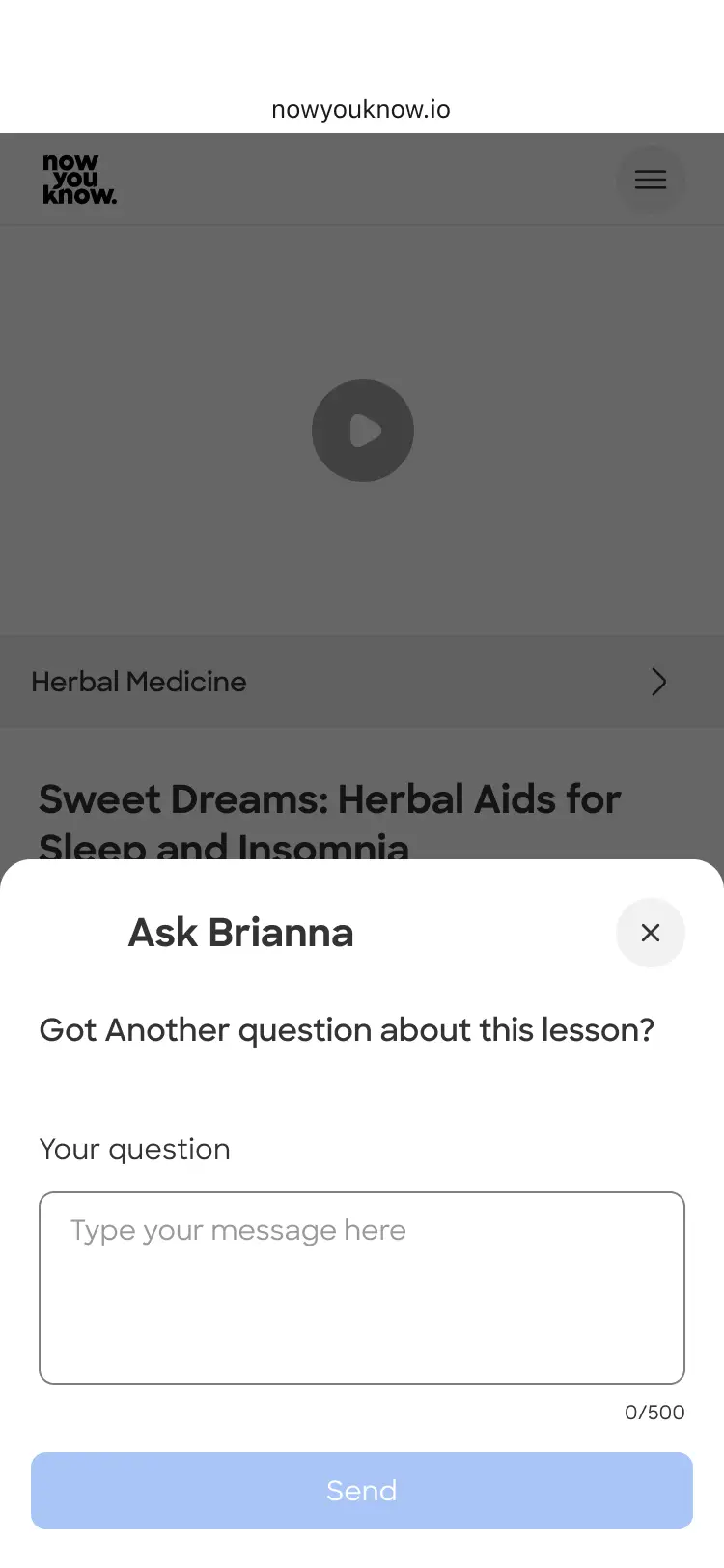
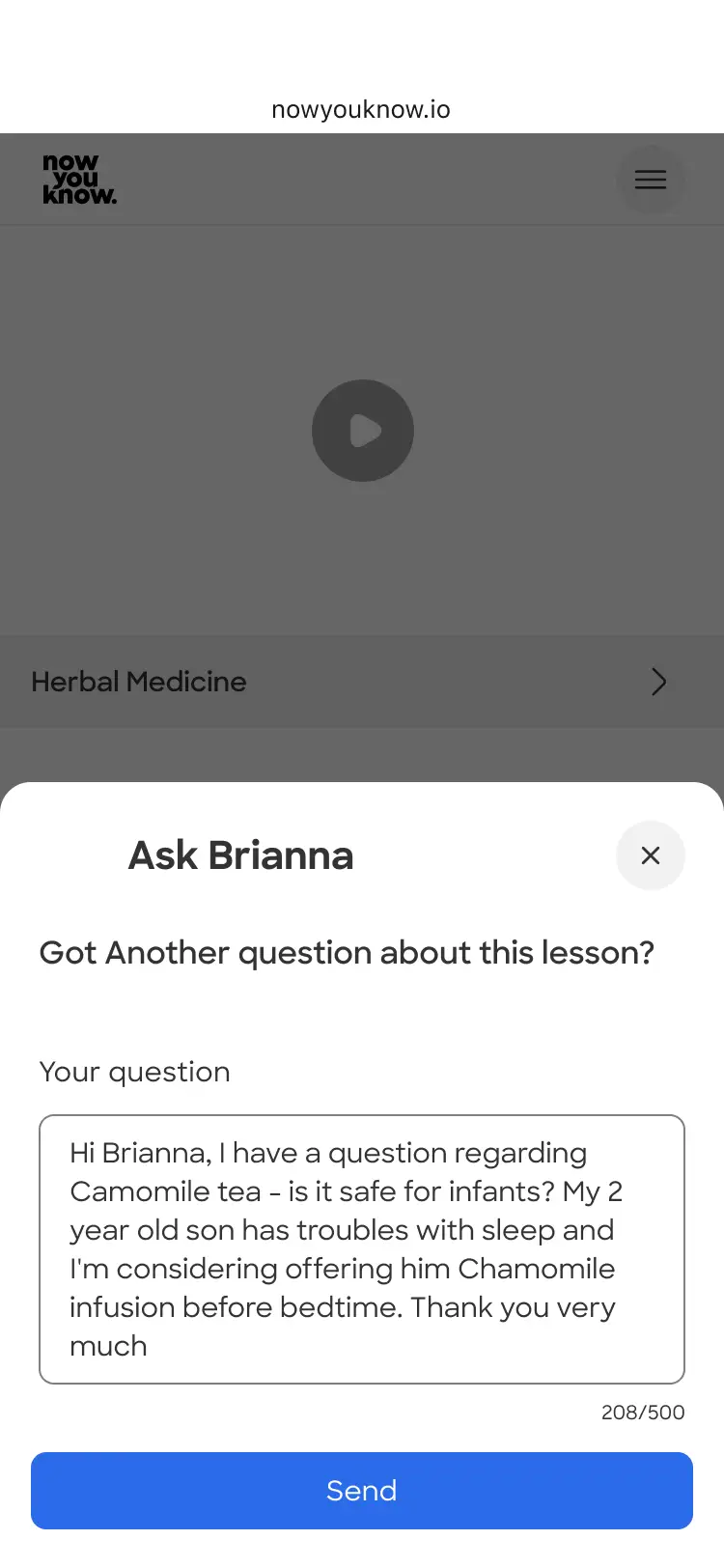
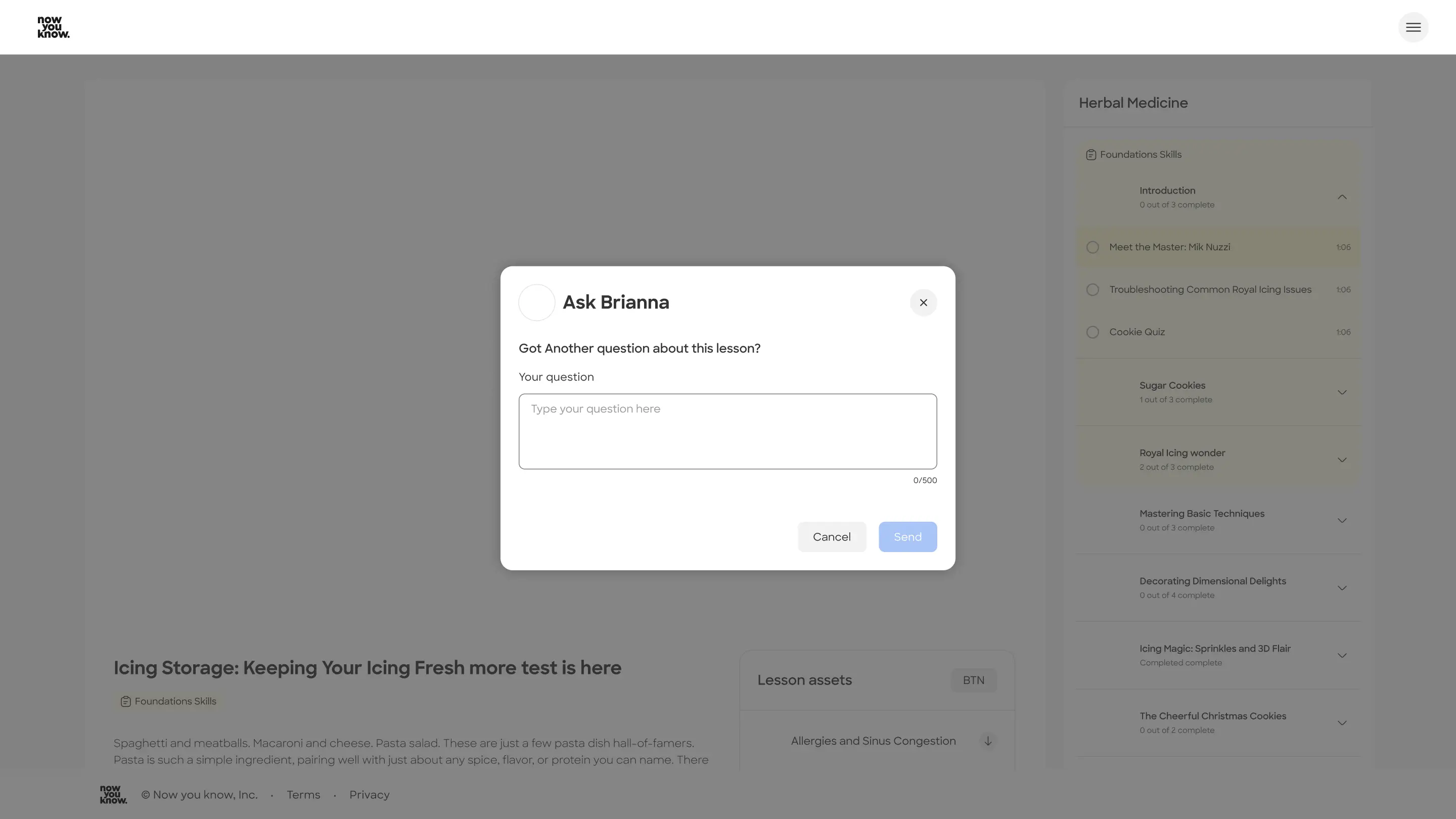
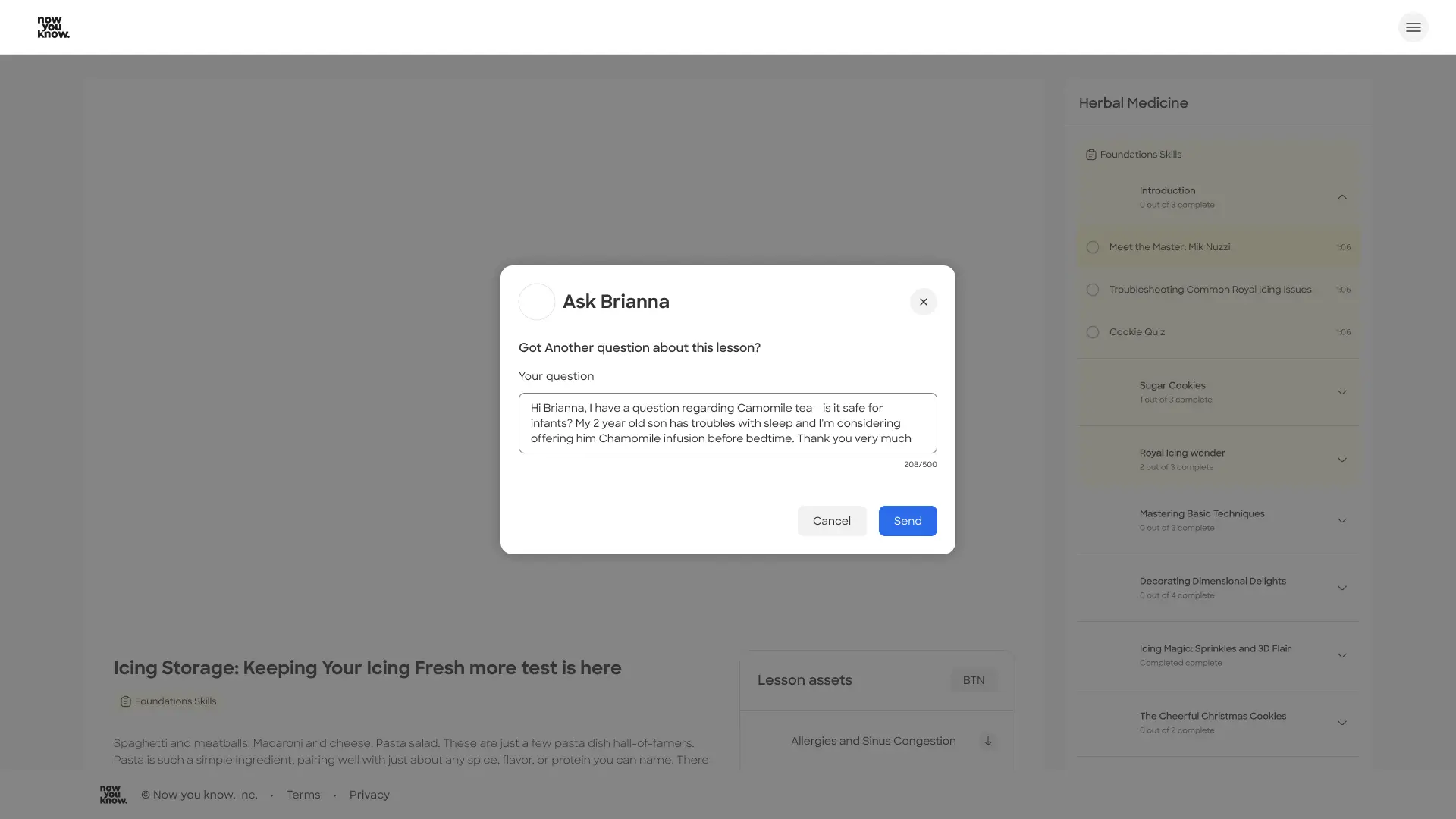
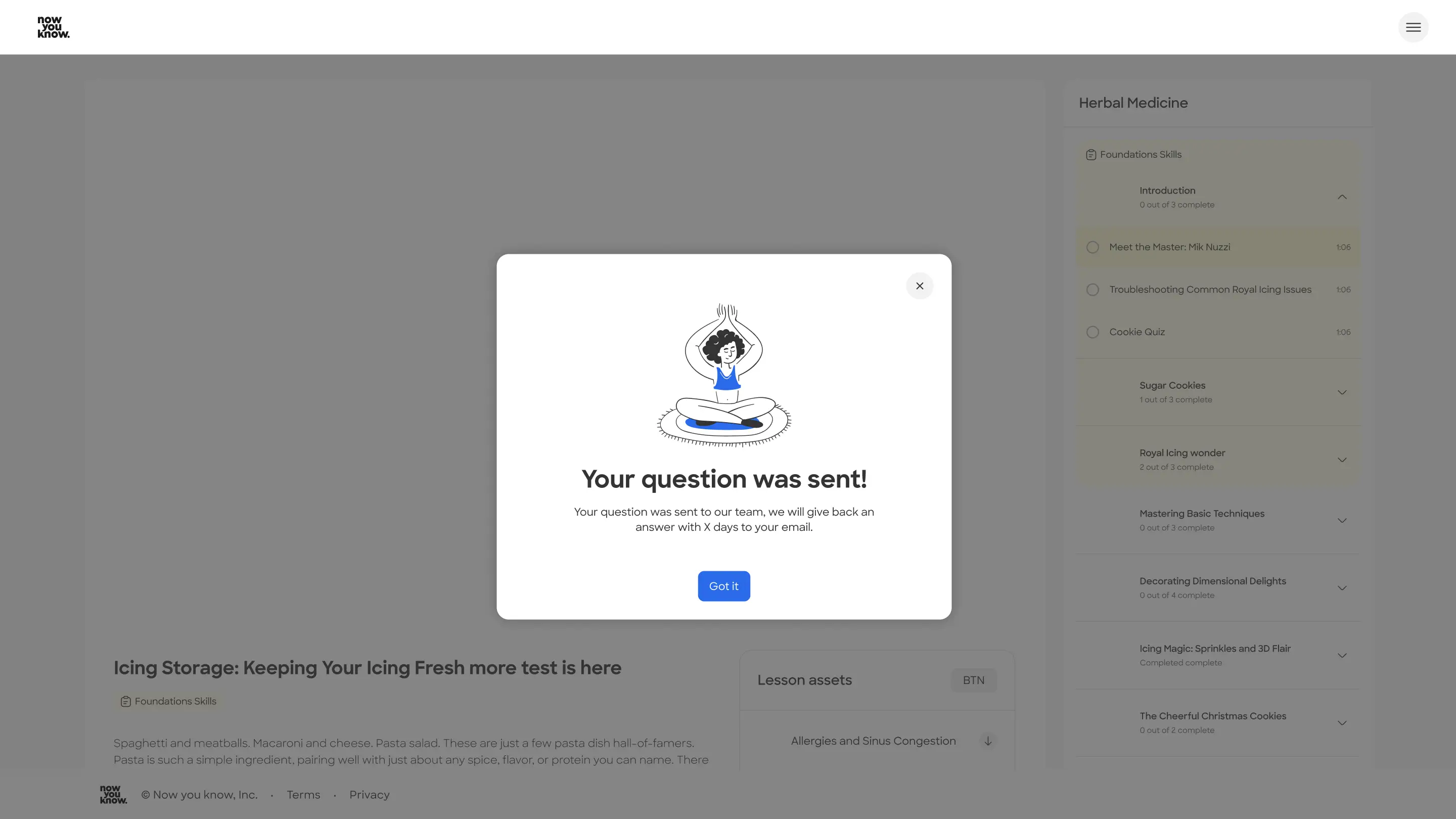
Future options - "Ask" button in content tab:
This allows the user an easy access to asking questions. I understood asking a question is just one of the main actions a user might want to do while viewing the lesson. Answers can still be viewed separately.
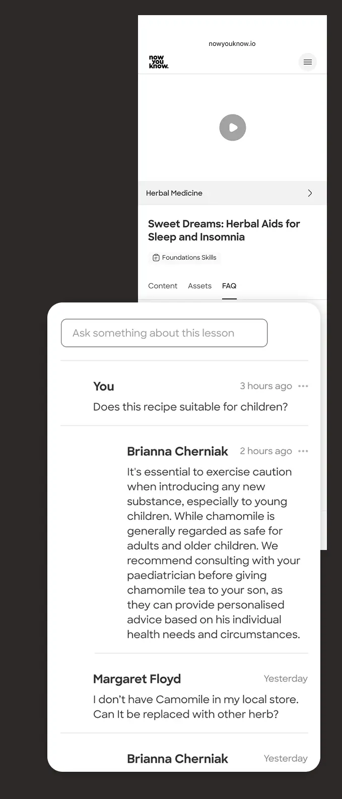
More ideas for future features
● Ai answers engine - driven from the Q&A we collected in Zendesk & Trustpilot
● Image upload option when writing a question
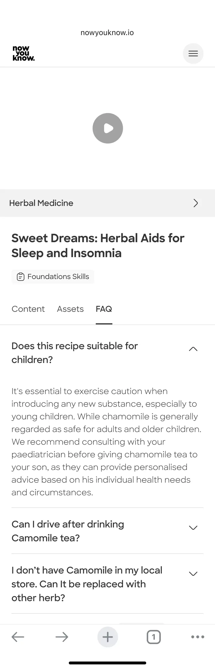
● Search in FAQ option
● Ask a question button - include in the end of the content tab
Final Ui screens
Social proof for added trust, clarity and a fluent experience
In the final stage, I added to the design system the elements I needed and created the larger breaking points for DEV.
Desktop
Let's talk
Prev project
Next project
Let's work together