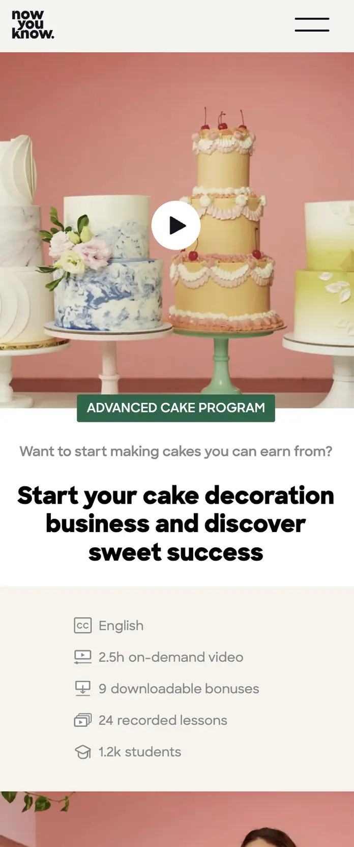
E-Learning platform LP

Framing the first step in a long-term E-Learning relationship

Project type
Research | Web design | Webflow building
About the company
E-Learning became very popular in the recent years. This company aims to create a platform to experience courses and classes easily and successfully, adding skills and value to your free time.
Mission
As different approaches of marketing and product serving arise, my role was to design and build landing pages that test the performence of each one of them.

In this project, the company offered users who enrolled a basic course the oppurtunity to purchase an advanced course. From a marketial point of view, this LP was build around value blocks that sum up the large benifit of enrolling the course, including downloadable bonuses, a special closed community, a certificate upon completion etc.
How we achieved conversion?
My mission was to sell the added value of the advanced course to users who are already "in the club" of the teachers, and are eager to learn even more.

The users got an email with a personal invitation and ads inviting them to check out the new course for experienced bakers.

Here's how we did it:
A hero with an auto play preview video and a full promotional video.
A sticky CTA to enroll top bar (shown in bright purple in the bottom of this page)
Features and details are shown above the fold to decrease doughts and answer basic questions.
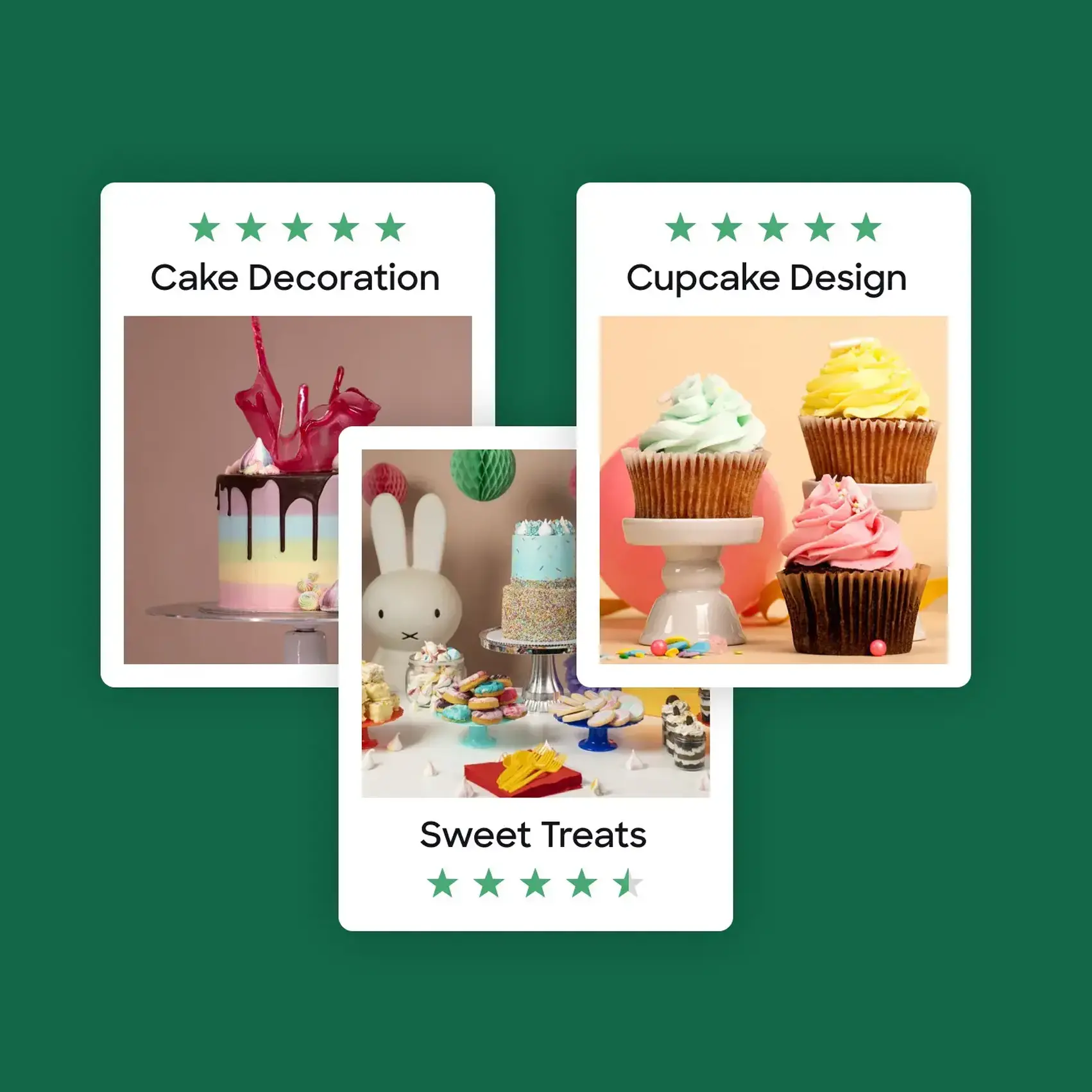
Using the previous, best seller, courses, to mark the opportunity to learn more from the successful professional experts who teach the course. Also, learning in THIS platform, which the user already knows and experienced.
Showing credentials and social proof - user reviews.
Sections of preview to mark the added value and provide a sneak peak - videos from eachcontent chunk of the suggested course. The user feels as if she's "almost there", making the enrollment step obvious.
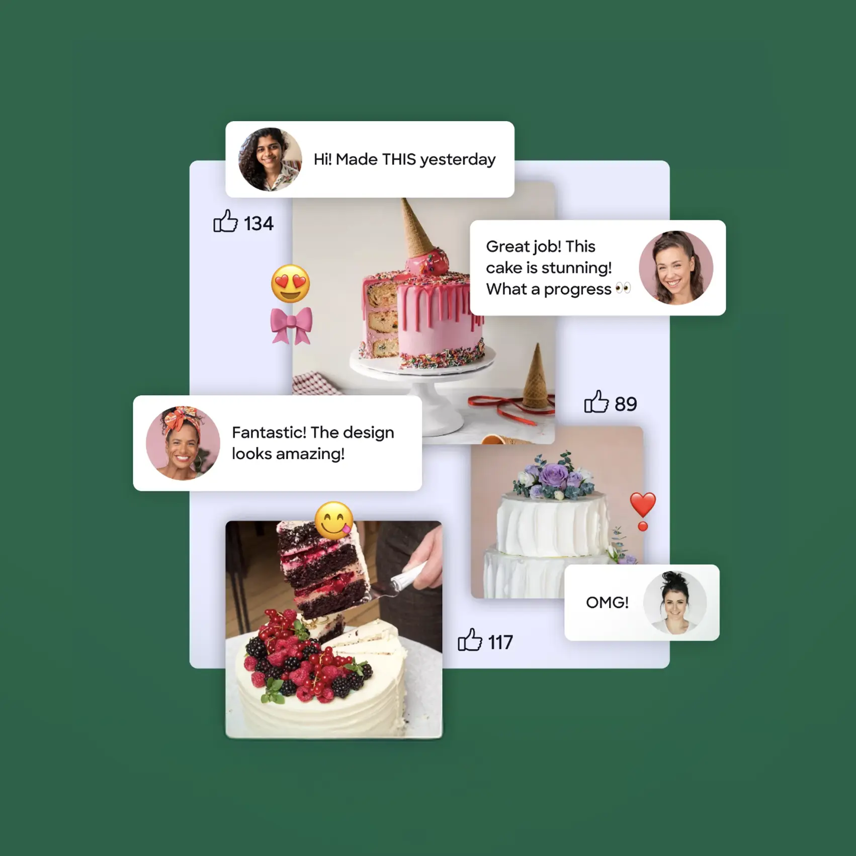
A ui illustration in the section which is talking about the closed community for students. Very exclusive!
Large image of the signed personal certificate the user will receive upon completing the course. This feature and design became part of all the courses and an important part of the marketing plan of each LP.
Best for last - the sum up list, summing up all the value of the content and the features, using the yellow markup circles following the user along the way when scrolling the page. At it's bottom, the special offer and main CTA.
Prev project
Next project
Let's work together
Let's talk