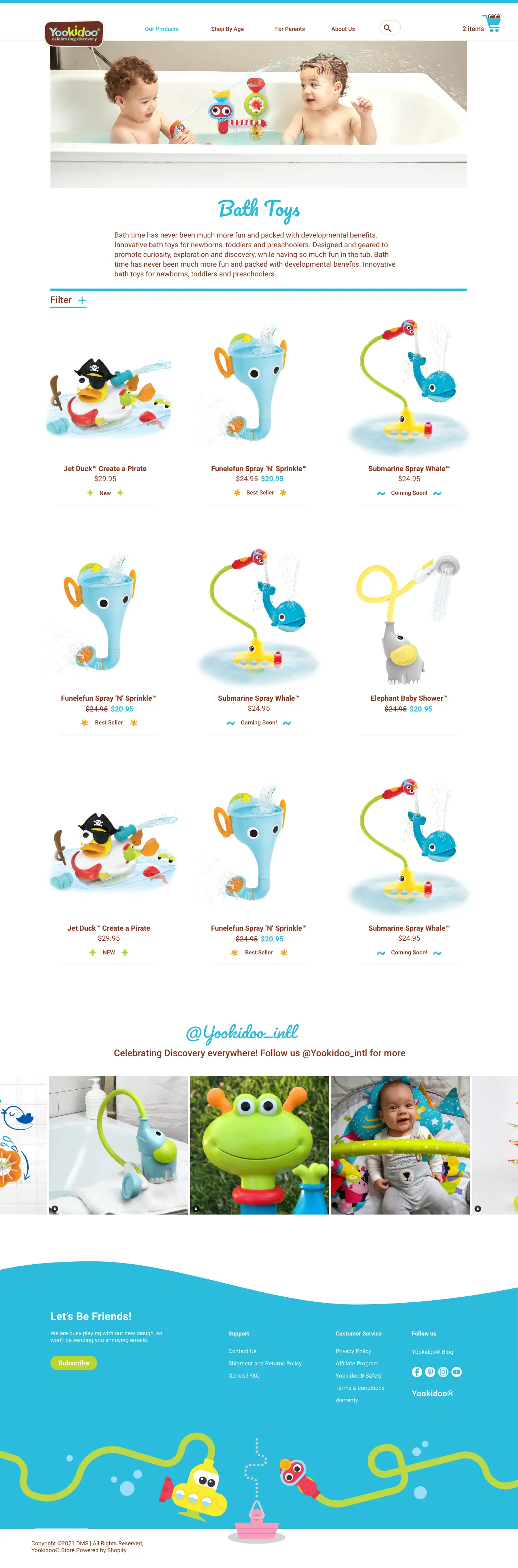
Two previous brand websites combined into one brand store, which features many different opportunities to reveal the brand vision and language, adding value to the experience in the store.
Keeping the focus on the brand and the experience is, in my opinion, the key to selling the products profitably. We want to improve the engagement, create a good impression and distinction in our field and, by all those, leading to satisfying purchases & warm customer reviews.
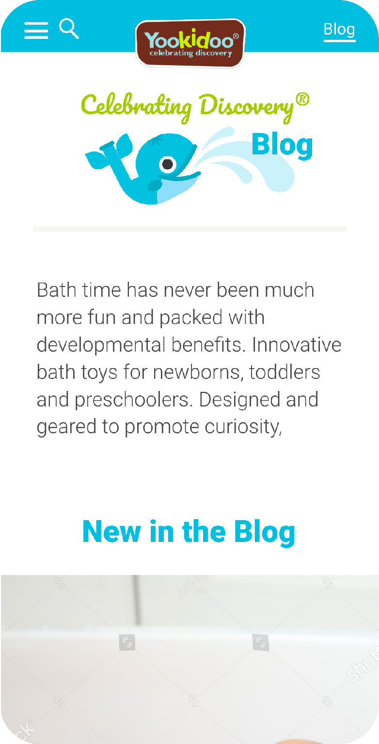
✔️ Responsive website
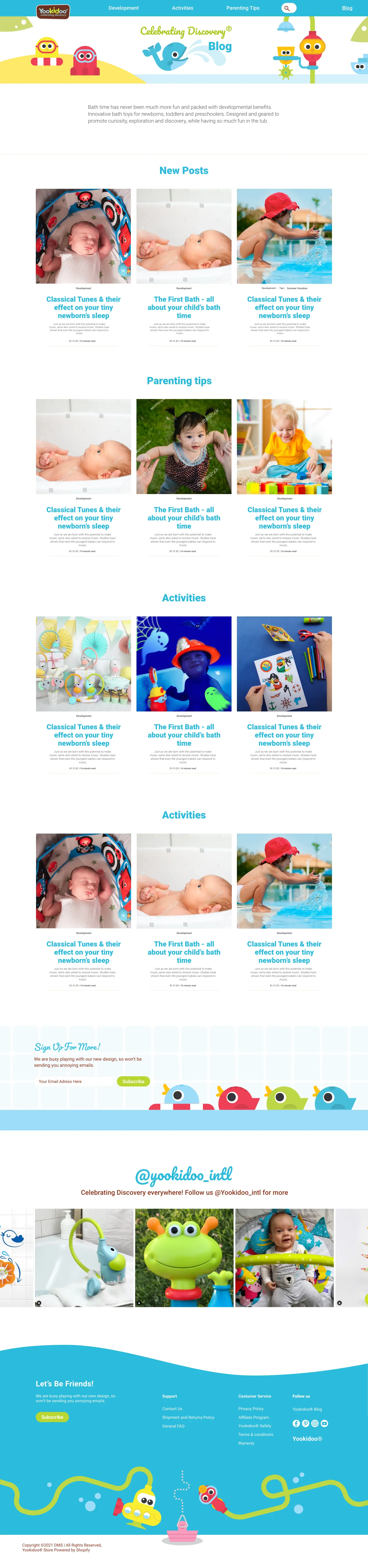
✔️ Shopify-based
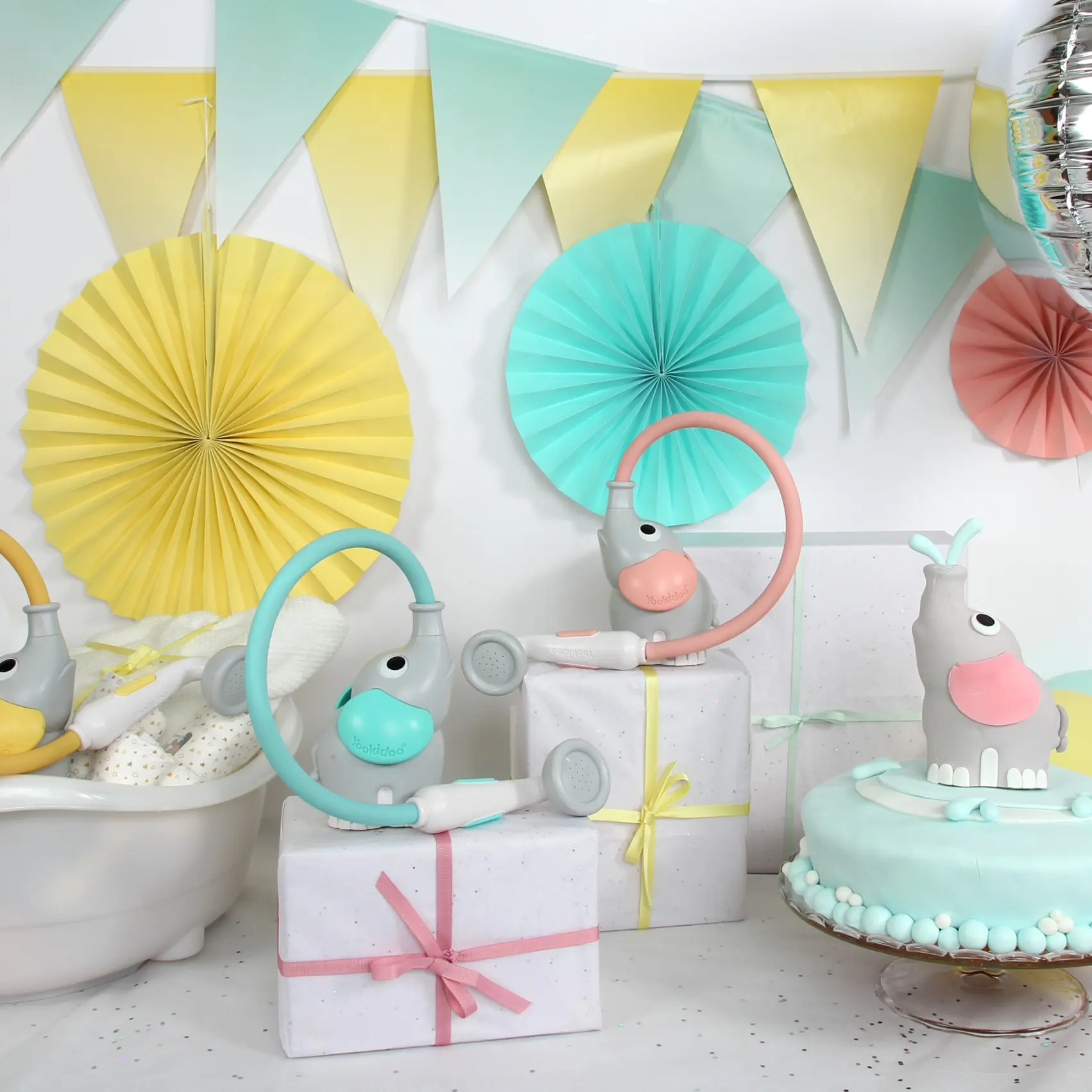
✔️ Brand content
.png)